Subscription growth hack (by PayKickstart)
Facebook Group - 3,932 members
Visit Group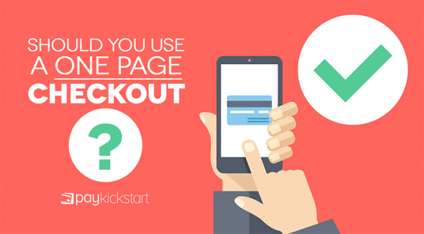
There’s a longstanding debate about whether or not you should use a one page checkout for your shopping cart.
On the one hand, it presents everything for your shoppers up front.
On the other hand, a long form may be daunting and increase the chances of abandonment.
There are different schools of thought about the topic. Some swear by one page checkout flows and others only use multi-step checkouts.
Neither group is right or wrong.
I can’t decide whether you should or shouldn’t use a one page checkout.
Instead, I’ll share the pros and cons and equip you with the information you need to make a better decision.
First, a bit of background.
A one page checkout displays all the information associated with the checkout process. It usually includes billing and shipping fields, name, email, price, basket contents, and payment information on the same page.
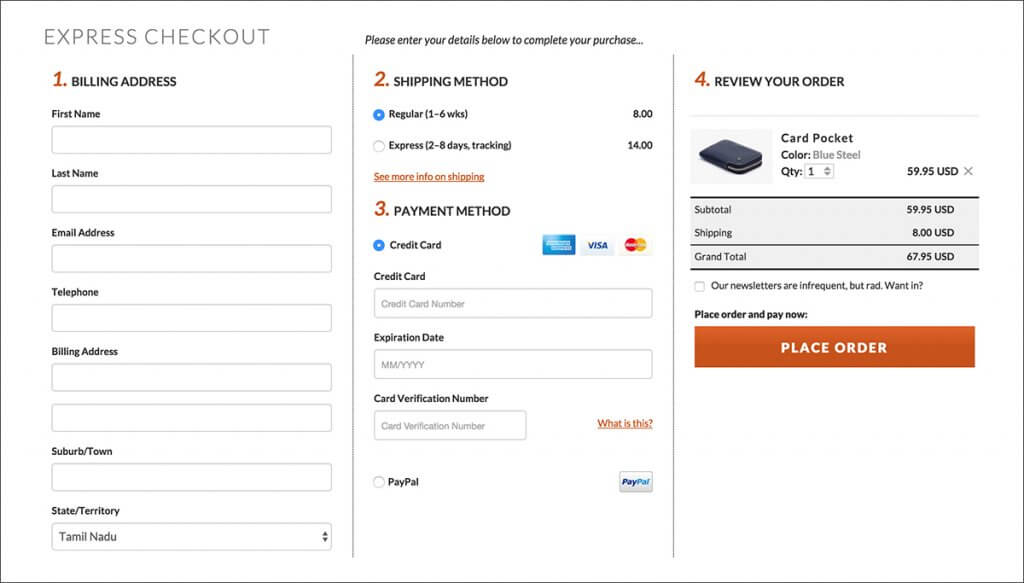
Image source: Bellroy
They were first implemented as a way to simplify the checkout process by reducing clicks and the number of pages. To that end, they’ve worked. Let’s look at the pros:
This was the original purpose of the one page checkout. On a desktop computer, it’s much easier to see data and review your purchase because everything is on the same page.
The customer doesn’t need to click through multiple pages to find important information like shipping or the final price.
At the same time, they know what information needs to be provided.
When you can see all the necessary fields to fill at once, it appears easier to fill out. This is especially true when a consumer doesn’t have the time (or motivation) to decipher the different pages in the checkout flow.
Whether or not it’s easier in practice is a different matter entirely.
When compared to multi-page checkout, it’s much faster for the customer to get through it. It was found that one page checkout is almost a minute faster than multi-page checkout.
In a world where people have short attention spans, this is a distinct advantage and may result in a sizeable conversion lift.
There are a lot of advantages but there are still a few drawbacks associated with a one page checkout.
This is a big drawback of one page checkouts. You can’t see where users are dropping off in your checkout process.
This is a big deal when you’re trying to optimize your sales funnel. With a one page checkout, either a person becomes a customer or they don’t.
It’s difficult to draw insights from that process.
With a multi-step checkout, you can see where people are dropping off tweak the flow accordingly.
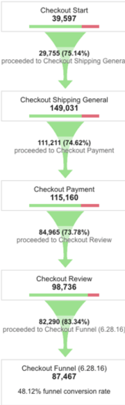
Source: Moovweb
In the above image, you can see exactly what’s happening at each step of the checkout process. With that information, you can isolate issues and run tests to help you improve conversion rates over time.
I mentioned that one of the pros of a one page checkout is the fact that it appears easier. This is mainly for desktop users. On a mobile device, the opposite is true.
It can be intimidating to navigate the necessary form fields and type all of the information needed at one go. I, personally, dislike the process of filling out long forms on my phone because of the zooming in and out.
I’m not alone.
This is another drawback of single page checkouts. It’s no secret that up to 70% or more of people who initiate the checkout process won’t’ complete it.
It has also been proven that abandoned cart emails can recover up to 15% of your lost revenue.
With a one page checkout, there’s no way for users to submit their contact details before abandoning the cart. That means you’ll have a hard time sending follow up abandoned cart messages.
If you do decide to implement a one page checkout for your shopping cart, there are a number of ways to optimize the process. Your customers won’t feel as intimidated when filling out their information which will improve your conversion rates across the board.
Put elements where they’re expected to be.
For example, you should collect name and email first, then billing information, and finally credit card information. Also, you should only ask for any particular piece of information once.
For example, when you ask for name and email, you should autofill the name in the billing section. When you ask for shipping address, it should be auto-filled in the billing section as well.
Part of the reason people abandon carts is due to confusion. They don’t know what the price is, they don’t know how to proceed, and they don’t know what they’re supposed to provide.
It seems like a foregone conclusion that your final CTA should be clear.
Don’t take it for granted.
Perform usability tests to make sure your CTA button is clear and people will know what’s going to happen after they fill it out.
At the same time, ensure the final price is also clear. This includes an itemized statement of shipping costs, cost of goods purchased, and any tax information before showing the final price.
Autofill forms can reduce the work of your potential customers and speed up the checkout process. Instead of having to type out the info, they’ll start and the browser will automatically finish it for them.
You can learn more about implementing autofill on your forms here.
I’m not in a position to tell you whether or not one page checkouts are ideal for your particular situation. There are too many factors involved.
Instead of doing that, this article has focused on the pros and cons of using a one page checkout. There are major advantages such as fewer clicks as well as major drawbacks like being unable to accurately measure the steps in your funnel.
If you do go with a one page checkout, keep the best practices I mentioned here in mind. They’ll help you build a better checkout right from the beginning.
Let me know what you think in the comments and don’t forget to share.
Matt Callen is co-founder of PayKickstart. He has founded several million dollar online businesses and lives in Indianapolis. Since 2006, he has helped hundreds of thousands of entrepreneurs scale and grow their online businesses with software and automation.
Read More About Matt Callen
Talk to a knowledgeable product specialist to learn more about your requirements and ensure PayKickstart is the perfect fit for your needs.
