Subscription growth hack (by PayKickstart)
Facebook Group - 3,932 members
Visit Group
The emergence of Covid has carried a heavy toll on a range of industries. Many companies that have previously grown accustomed to receiving a healthy portion of their revenue in brick and mortar stores have had to quickly adapt to the changing commerce landscape.
As lockdowns interrupt business and the rise of work from home (WFH) jobs keep people away from high streets around the world, it’s become vital for many companies to make a transition into an online space in order to leverage sales.
However, this has made the eCommerce marketplace significantly more competitive, with increasing numbers of businesses looking to operate online.
(Image: Smart Insight)
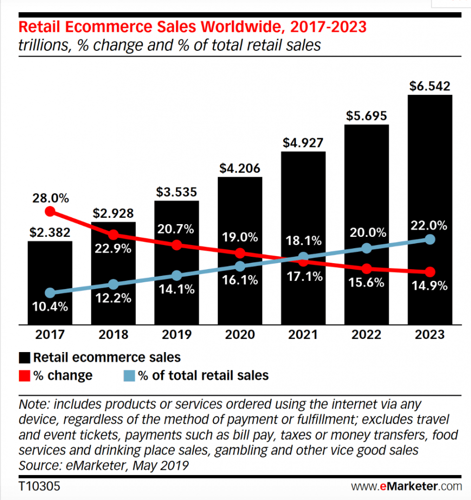
Even after the pandemic has been beaten, figures show that the shift towards online conversions will only accelerate as we progress through the 2020s. This means that website optimization within businesses has become imperative.
One of the most vital ways to optimize a website to leverage conversions comes in the form of landing page optimization. Your landing page represents the front door of your website. It’s where potential customers arrive, or ‘land’ on your first page after being redirected from a link.
As your landing page is likely the first thing that potential customers see when they interact with your business online, it’s vital that it holds enough appeal, engagement and usability to encourage them to keep browsing and ultimately make a purchase on your pages.
With this in mind, let’s take a comprehensive look into six key tips for optimizing your landing page in order to win more customer conversions:
Building a simplistic landing page might seem like a counterintuitive move. After all, it’s your big chance to woo customers or potential clients. Your selling point needs to explain to individuals exactly what your company is about in a single snapshot, so keeping things simple might seem like you’re missing out on an opportunity.
However, when you focus on simplicity, it helps to get rid of your website’s visual clutter, leaving visitors to quickly see your call to action. Your call to action will invariably be the most important part of your landing page. It’s the button, or prompt, that’s designed to snap visitors out of their passive browsing state and into making an affirmative decision – whether it’s clicking to find out more, signing up to a mailing list, or buying an offer.
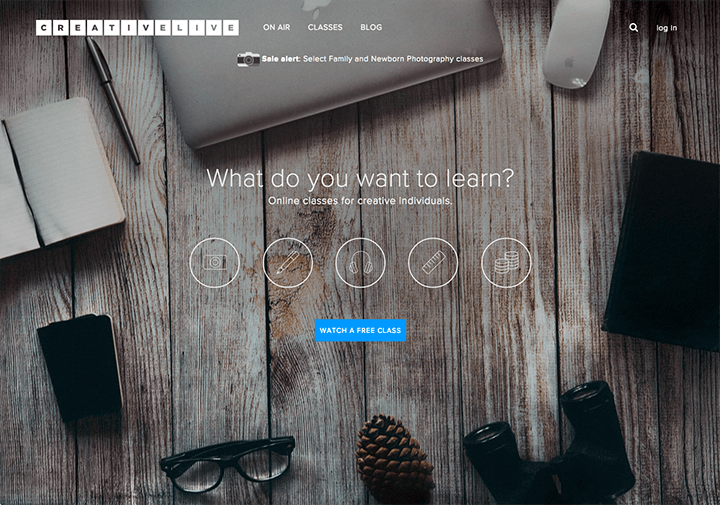
(Image: Onelfri)
Above, we can see an example of an effective simplified landing page. The background image sets the tone and users simply have a choice to select the type of online class that they’re most interested in. The call to action is clearly visible in a contrasting colour and it offers visitors the chance to watch a class for free.
Although it’s tempting to list all of the reasons why your business is the best in its industry, it’s wise to avoid bewildering levels of textual clutter and to simply offer users to find out more via a click than to try too hard in selling your product or service on the first page.
Another perk of having a simple landing page is that visitors are unlikely to encounter longer page loading times when compared to one that’s jam-packed with multimedia content and features. Remember, your product pages can be as information-rich as you want them to be, meaning that your landing page can better compliment your website aesthetic.
Many website owners who are well versed in the world of search engine optimization (SEO) will understand the power of keywording on websites. However, for your landing page, it’s important to embrace more persuasive forms of copy.
By utilizing ‘power words’, you can turn an ineffective landing page into something of a cash cow.
To use power words effectively, it’s important to understand the emotional trigger points that customers may have when looking to make purchases of products like those your business offers. Creating a compelling message to accompany your product could turn an engaging page into something that will lead to scores of conversions.
However, picking the right power words for your landing page can be more complicated than finding a catchy phrase or picking certain words to use. Structure your copy in ways that appeal to your potential customers on an emotional level. To help provide clarity on this, Wordstream came up with the example below:
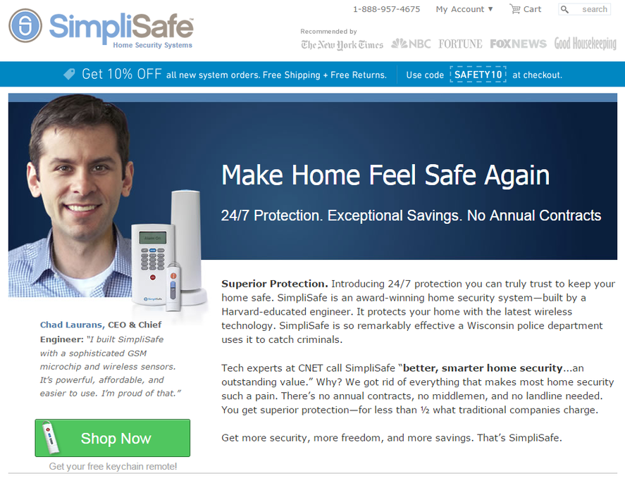
(Image: Wordstream)
Here, the inclusion of the word ‘again’ is very effective. It implies that the visitor had once felt safe in their home but doesn’t anymore. This helps to establish a sense of urgency in the visitor aiming to recapture their sense of safety.
Of course, it’s possible to combine power words and with SEO techniques by using tools like Ahrefs in a bid to further optimize your website. This can help to underline your message while bringing greater levels of organic traffic to your landing page.
When directing visitors to your landing page, it’s important to ensure that the page remains relevant despite adding power words and looking to optimize the copy around your images.
Here, some website owners can fall into the trap of trying so hard to woo their customers that they actually lose track of what their site is all about.
Your visitors will find your page through pay-per-click (PPC) ads and social media, so it’s vital that your content remains relevant to your adverts and promotions at all times.
If, for example, you find an advertisement about car insurance from a price comparison company. You’re interested in buying a used car and are keen to gain quotes to see how much insurance costs, but when you navigate to the website you find that it’s actually covering housing insurance instead.
While some website owners might like the idea of listing misleading ads in a bid to bring more traffic onto their landing page, this can be a costly idea as it could lead to an increased number of bouncebacks from your page – lowering your website’s rating on search engines like Google.
When optimizing your landing page, it’s important to think about the message that you’re sending visitors. What will they be expecting when they arrive on your site? By optimizing your page to offer more relevance to your visitors, you will see much better results.
The development of fully functioning, customizable popup widget checkouts have made the importance of landing page accuracy all the more vital for businesses. Through platforms like PayKickstart, it’s possible to leverage conversions without a visitor needing to navigate away from a landing page towards a checkout.
With over 40 templates to choose from and fully customizable checkout templates, businesses can use popup widget checkouts to welcome visitors from online referrals and arrange the checkout process of a product or service in a fully streamlined fashion – meaning that landing page accuracy and engaging content can combine for even more accessible sales.
People are sociable creatures, and they enjoy finding justification from others when it comes to the things they do.
This can extend the world of online shopping, too. We’ve become accustomed to buying products with the highest user ratings from companies with the best TrustPilot reviews.
It’s important to take advantage of the fact that shoppers love trustworthy websites and products. Where possible, show social proof of your peer acceptance. There are plenty of ways in which you can demonstrate value in this field. Whether you choose to share your social metrics like the number of followers you have on Twitter or Facebook, or your YouTube subscribers, it’s entirely up to you. But simply showing that your company is being talked about can be enough for some visitors to feel justified in making a purchase on your website.
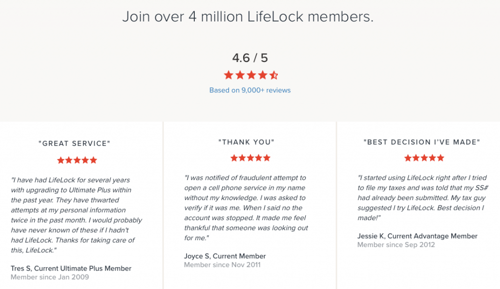
(Image: Instapage)
In the example above, we can see this website owner opted to include the company’s strong user review figures as a means of social proofing their landing page. With some glowing reviews in accompaniment, visitors can find comfort in knowing that they’re making a strong purchasing decision.
Of course, it’s vital to know what’s working when it comes to your landing pages and what isn’t, and that’s why many website owners turn to tools like Google Analytics to ensure that their site is performing the way it should.
Website analytics platforms can help to show website owners vast visualizations regarding the traffic that their landing pages receive, where it comes from, what visitors do after ‘landing’ and how often bouncebacks occur.
Analytics tools like Finteza can also identify the key indicators between good and ‘bad’ traffic – helping to indicate the number of arrivals that you receive and the percentage of visitors who are in fact crawler bots. This can help website owners to develop a greater understanding of what’s working and what isn’t.
Other tools can help website owners in monitoring their performance. A/B testing, in particular, is an excellent way for businesses to test out different landing page designs and compare them in terms of how many conversions they achieve and the level of bouncebacks they prompt. Tools like Unbounce are particularly strong for A/B testing and the company’s new Smart Traffic feature is capable of utilizing AI to discover which individual components of a landing page are working on a website and which aren’t.
Furthermore, better analysing your sales funnel performance can help you to create better performing offers and free trials for prospective customers and display them prominently on your landing pages.
The phrase ‘above the fold’ can be traced back to the golden age of the broadsheet newspapers. Back when newspapers ruled the world, the most engaging and important stories were always positioned on the front page above where the paper would fold in order to show customers the leading headlines to encourage them to make a purchase.
Landing pages certainly don’t fold, but they do have a designated area that’s guaranteed to show when visitors arrive, with other information that doesn’t become visible until the user scrolls down.
In internet parlance, ‘above the fold’ refers to the instantly visible space on a website’s landing page or homepage. Given that the attention span of internet users is typically low at any given time, it’s vital that you display your call to action, most important messaging and key images in clear view of the browser.
However, in this age of various different browsing devices – from computers to laptops, to smartphone and tablets – it can be tricky to know exactly how much of your page is in view at any given time. Fortunately, there are plenty of scroll map options out there to help you to know where your landing page is on show immediately and where it isn’t. This can help you to optimize your messaging accordingly.
The world of eCommerce and internet marketing is as congested and competitive as ever. In this tricky landscape, it’s vital that you market your business and its products effectively wherever you can. Fortunately, there are plenty of great tips and tricks to ensure that you avoid missing out on customers through bouncebacks and a lack of interest in your messaging. Just remember that your landing page is your biggest chance to make an impression – don’t pass the opportunity up.
Dmytro is a CEO at Solvid, a long-form content creation agency based in London. His work has been published in Shopify, IBM, Entrepreneur, BuzzSumo, Campaign Monitor and Tech Radar.
Read More About Dmytro Spilka
Talk to a knowledgeable product specialist to learn more about your requirements and ensure PayKickstart is the perfect fit for your needs.
