
Subscription growth hack (by PayKickstart)
Facebook Group - 3,932 members
Visit Group
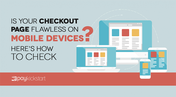
Did you know that a majority of web traffic now comes from mobile devices, such as smartphones and tablets? That’s right, more people now use their mobile devices to surf the web than personal computers. As such, it’s vital to have a mobile optimized website and checkout page.
Unfortunately, shopping cart abandonment rates remain high. In fact, abandonment rates of 80 percent or more are not unheard of. If your website, shopping cart, and checkout page are not mobile friendly, mobile users will be more likely to abandon their products. For ecommerce stores and other online sellers, this will result in lost revenues.
That’s why we’re going to go over why having a flawless mobile checkout page is important and some of the many things you should consider when designing a mobile checkout page.
First off, you can’t ignore mobile devices. Forrester Research has found that smartphones are used in roughly one-third of total U.S. retails sales at some point in the buying process. This would total more than $1 trillion dollars. To be clear, that doesn’t mean that customers will be making purchases via their smartphone. They could be conducting research or partaking in another activity.
On Cyber Monday in 2018, some 54 percent of visitors originated from mobile devices. Meanwhile, 30 percent of purchases were made via a mobile device. Yet while mobile devices grow more common, customers are also demanding. 40 percent of consumers report that they will abandon a website if it offers a poor mobile experience.
Using mobile devices is likely to become more widespread in the future. So if you have a poor mobile checkout page, you could be driving your customers away in droves!
You already have a shopping cart. Can’t mobile users simply use that? Maybe, if it has been optimized for mobile use and if it’s responsive. If not, your shopping cart will almost certainly offer a subpar experience.
There are (at least) two important factors you need to consider. First, screen sizes can vary dramatically between mobile devices and traditional PCs, and also among mobile devices themselves. Personal laptops usually have a screen size between 12 to 16 inches. Most smartphones have screens that are approximately 6 inches in size. Many tablets have screens around 10 inches in size.

Screen sizes can vary wildly.
First, let’s consider how you can address different screen sizes. How can you design a website that functions as well on a six inch screen as it does on a 10 or 14 inch screen? One solution is to make the shopping cart “responsive.”
This means that the website will adjust to the screen’s size. Buttons will shrink, menus and images might be hidden, so on and so forth. Designing an effective mobile responsive website is as much a science as an art. Buttons, font sizes, and everything else must be just the right size.
You also want to avoid having your customers click through multiple links and pages. If possible, provide all the vital information on one page.
Input methods for mobile devices are far different than personal computers. With a PC, you’ll likely use a mouse, trackpad, or similar input device. You’ll also have access to a keyboard. With mobile devices, you’ll usually rely on a touch screen.
In practice, the smaller screen and reliance on touch input can make mobile devices more difficult to use. Typing in information, like shipping addresses, can be especially cumbersome on a mobile device.

Autoforms at work!
Even the best touch screen won’t offer as easy of text input as a keyboard. Your goal then should be to eliminate as much text input as possible. Unfortunately, your checkout page and/or shopping cart will likely require a lot of text input.
You’ll likely need to get a shipping address, billing address, credit card number, expiration date, security code, email, and other details. These can be a real pain for customers to type in, especially on mobile devices.
In fact, 39 percent of customers who abandoned a mobile shopping cart cited problems with entering personal details. Fortunately, by using autocomplete forms, you can reduce or eliminate the need to put this information in. The forms will be automatically filled in, saving, the customer time and effort.

Bad mobile experiences lead to abandoned carts.
Another useful feature is to only show a numeric keypad when customers have to type in credit card and other “numbers only” information. If you display the full keyboard on a mobile shopping cart, the keys will be very small and hard to use.
We’ve found several factors can increase conversions and sales on any checkout page. A great mobile checkout page will be able to effectively integrate these features without ruining user experience. First, trust is a huge issue for online shoppers. There are steps you can take to build trust. For example, we’ve found security and guarantee badges lower abandonment rates and boost conversions.

Second, your shopping cart offers an opportunity to drum up additional sales. Upselling, for example, is a very effective way to increase sales. Basically, you offer customers the opportunity to add additional, related products and services (i.e. a warranty) right on the checkout page.
PayKickstart allows you to utilize upselling features and trust-building badges right in your checkout page, mobile or otherwise. Your mobile checkout page doesn’t have to be a lesser version of your regular checkout page, but it does need to be optimized.
Most shopping carts are now mobile optimized. However, some companies optimize better than others. When selecting a shopping cart, make sure you pay particularly close attention to mobile performance.
At PayKickstart, we’ve spent a lot of time building checkout pages that are all but flawless on mobile devices. And we make sure that our mobile checkout pages are still effective at drumming up additional sales and ensuring a high conversion rate.
Matt Callen is co-founder of PayKickstart. He has founded several million dollar online businesses and lives in Indianapolis. Since 2006, he has helped hundreds of thousands of entrepreneurs scale and grow their online businesses with software and automation.
Read More About Matt Callen
Talk to a knowledgeable product specialist to learn more about your requirements and ensure PayKickstart is the perfect fit for your needs.

 Ann Smarty
 Dan Macharia