Subscription growth hack (by PayKickstart)
Facebook Group - 3,932 members
Visit Group
As more and more customers are getting used to shopping online, shopping and checkout expectations are growing exponentially in just about any sector from small ecommerce retailers to SaaS platforms.
Which customer expectations should you be meeting (and exceeding) at checkout?
According to Google, 53% of visits are abandoned if a mobile site takes longer than three seconds to load.
Now imagine that your customer has gone so far as to reach the checkout page to leave in frustration because it took too long to load.
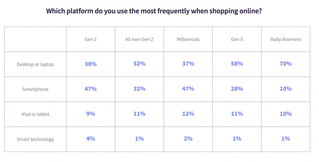
The variety of devices consumers are using also puts a lot of stress on checkout page developers. While mobile friendliness is obviously crucial, accommodating all possible devices is a must:

So make sure to test your own checkout page across many devices and browsers.
PayKickstart’s checkout pop-up widgets are the fastest payment getaways out there. Allow your customers to pay or upgrade with one click of a button without loading a new page:
You can choose your own widget template and customize it to match your site.
Most importantly remove all the checkout barriers you can to make the buying process as smooth as possible. These include:
You can’t expect your customer to make a purchase without letting them know what it is they are buying. Your customer needs to be sure they are buying the right thing. Otherwise they will have to go back to the product page and you may lose the sale.
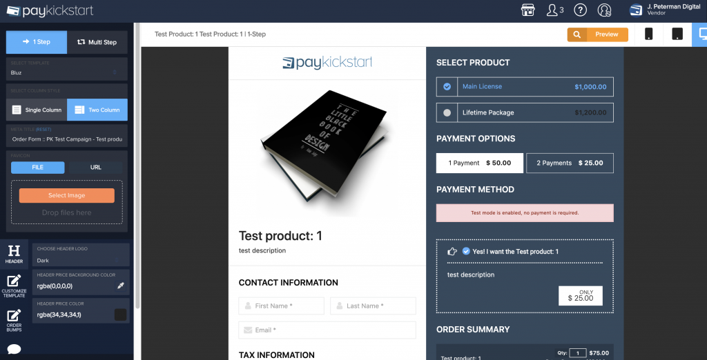
Make sure to include a concise and accurate product description. It is a good idea to compliment it with a product image as well to help your customer feel more comfortable about what they are purchasing.
PayKickstart offers a quick and mobile-friendly checkout solution that will be easy to set up and test. You can customize it to meet your needs to include the product details, total price, etc.

More and more web users expect to see alternative payment methods supported as they land on the checkout page. PaySafe did a survey of Generation-Z consumers (born between 1990s and 2010) and identified that younger consumers were driving the diversification of the payments landscape.
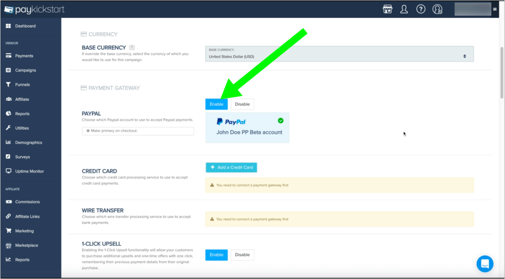
PayKickstart offers a variety of payment integrations including:

Diverse payment landscape is one of the most important SaaS payment processing trend out there.
To allow even more flexibility, consider setting up a split-payment option, especially if you provide a one-time payment product which is quite expensive. With it, customers will have an option to select the full payment or the split-payments you have set up.
You can also enable a split-payment option for paid subscription trials.
Privacy regulation has been a huge trend since 2018, following a few huge privacy scandals (including Facebook and Google Plus Data leaks). As a result, more and more customers are concerned about their private data.
Make it clear that their privacy is safe with you: Your site is protected, your payment gateway is secure and you are not going to re-use or sell any data. It is also a good idea to point out that you will only use their email to update on the order status or send a product update. Make sure you have a clear privacy policy in place. Here are a few great privacy policy generators to help you.
Most importantly, do what you preach. Think twice before emailing your past customers. Do you really have their consent to send them emails? It has always been a standard practice to grab your whole database of past customers’ emails and include them on your optin list for further deal and product updates. With the new regulations taking effect, you may find yourself risking fines when using your old email lists.
Instead of using a questionable list, find other ways to reach those old customers of yours. For example, using that old email database to create a new custom Facebook Audience and putting your brand in front of them through Facebook Ads is a much safer tactic.
Obviously, do your best to avoid red flags that may scare off your customers like expired SSL certificate warning messages (admittedly, these happen to the best of us).
Another idea is to use some trust and security badges on your checkout page to make it more trustworthy and help your buyer feel more comfortable. Consumers (especially an older age group) don’t trust online websites easily, so every bit helps.
Security badges like McAfee secure, Norton Secured etc. help build the trust factor a lot. Here’s a good collection of those that are available as a free download.
Here’s also a great research into which website weals create the most trust that includes more ideas, like accepted credits cards and “Google Trusted” badges that work particularly well because people recognize the brands and project that trust onto your page as well. A few takeaways that I have found particularly interesting are:
As the web is maturing, so are the consumers’ expectations for their browsing experiences. According to Adobe report, customer experience expectations are a lot higher coming from millennials than ever before.
In other words, the younger the customer, the higher the expectations.
The good news is, not many brands are keeping up.
This means providing a hassle-free checkout experience that meets your customers’ expectations will give you a strong competitive advantage and grow your client base and customer loyalty.
Ann Smarty is the co-founder of Smarty.Marketing, an SEO agency specialising in AEO/GEO, digital PR, and Reddit marketing. She is the former Editor-in-Chief of Search Engine Journal and a contributor to prominent search and social blogs, including Small Biz Trends and Mashable. Ann is also a frequent speaker at Pubcon and the host of a weekly Twitter chat #vcbuzz
Read More About Ann Smarty