Subscription growth hack (by PayKickstart)
Facebook Group - 3,932 members
Visit Group
No matter what your niche or the kind of products you sell, it’s safe to say that increasing the number of people who complete a purchase is important to you.
Exit popups, when used correctly, can help you make that happen.
Like many lead generation devices out there, people have mixed feelings about them.
Some people hate them and refuse to interact or use them.
Others swear by them.
I’m in neither camp but I do like to be guided by data.
The data here is clear. Exit popups work. In this article, you’ll learn a few strategies for using exit popups to increase your checkout conversions.
Most people that use exit popups on their websites focus on a single strategy that they’ve seen others use successfully.
There’s nothing wrong with following in the footsteps of those who’ve gone before you. It becomes an issue when everyone else in the world is using the same strategy as you.
I digress.
Let’s look at those strategies.
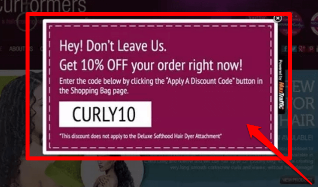
Most abandoned cart exit popups offer a discount on the order. Those convert pretty well.
You can take it a step further by showing specific popups for specific products.
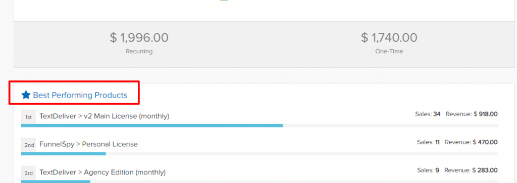
Identify your most popular or most valuable products. You can easily find that information in your PayKickstart dashboard. Just login and scroll down until you see an area that shows the product with the most sales.

Once you’ve identified the products, it’s important to understand why people are even leaving in the first place.
Perform a short survey that asks a simple question like:
These questions will help you understand why people are abandoning the cart in the first place. With those insights, you can create an abandonment popup that addresses the root of the problem.
If you realize people are leaving because of unexpected shipping costs, you can wave shipping fees for people who are abandoning the cart. If you realize it’s because of another reason, your exit popup can address those issues.
These are the most common types of exit popups for increasing revenue and conversions – especially on websites selling physical products.
The reasoning behind the popup is that people are about to leave your website because they didn’t find what they were looking for. Or, they’re leaving because they couldn’t quite afford your products.
When you add an exit discount to the mix, the people who didn’t find what they were looking for will still leave. They’re not the people you’re targeting.
The ones who couldn’t afford your product or weren’t quite ready to buy will sign up for the discount and buy your product sooner rather than later.
In fact, 72% of consumers admitted that coupons affected their buying decisions. 35% bought more of a product than planned and another 35% of customers bought from a brand that they would’ve otherwise ignored.
That’s the power of using discounts.
If someone didn’t find a product they’re interested in or only landed on your page accidentally then an exit discount may not make a difference.
Only show your popups to people who’re likely to be interested by setting a time delay before the popup appears.
How long do people usually stay on your website? If your average visitor stays on your page for one minute then set the exit delay for at least half that time.

Image source: Pixelter
Your exit popups don’t have to be focused on a product people are checking out right now. They can also be a great way to capture the attention of people who didn’t find what they were looking for.
You can use the opportunity to introduce new products they may not have seen or had the chance to check out properly.

Image source: beeketing
In the image above, you can see the company is using their exit popup to advertise new products the customer may not be familiar with.
I rarely see exit popups being used for this but it’s a great way to maximize the time your abandoning visitor stays on the page.
Implement simple exit surveys that ask your visitors what’s missing on your page. At first, you’ll use an open-ended question to find the major complaints.
After you’ve gotten a lot of feedback and implemented changes, use a survey that asks a multiple choice question. The answer options will be the things you identified as problems and addressed. This will let you know if you’ve solved the problem.
Rinse and repeat until your website is a lean mean conversion generating machine.
Urgency and scarcity are techniques that have been used before the internet was even an idea.
Why?
Because it works.
The same thing holds true for your exit popups. If you can combine your discounts with a hard deadline then people who may not have bought are being pushed by two factors.
It can drive your abandonment rates way down while helping you build an email list and buyer list. This strategy can also be used with a twist.
Instead of offering a limited time discount, only offer a limited number of coupon codes. This introduces scarcity and a bit of uncertainty.
If they’re a motivated buyer, they’ll act sooner rather than later.
Exit popups are a great way to capture abandoning visitors but they need to be used correctly. If you just create a popup with a simple discount, it’ll help you recover abandoned customers but you’re leaving a lot on the table.
Use the strategies I’ve mentioned here to add variety to your exit popup strategy, unlock feedback, and recover more abandoned visitors.
Let me know how you’re using exit popups in the comments and don’t forget to share.
Mark Thompson is CEO of PayKickstart and a serial entrepreneur. He is passionate about helping thousands of entrepreneurs and businesses grow through advice, automating payments and providing affiliate tools.
Read More About Mark Thompson