Subscription growth hack (by PayKickstart)
Facebook Group - 3,932 members
Visit Group
Some site owners believe that it is enough to create a beautiful bright picture of their resource, and traffic will flow to it like a stormy river. This is far from the case.
What is responsive web design? It is a tool that requires a careful approach. There are a number of tips and tricks that can help you create pages that encourage users to take targeted action. This article has collected six web design tips that will help you attract more customers to your site and increase sales.
The choice of colors is a controversial point. Some web designers choose shades that they like. Others rely on psychological research to find comfortable and relaxing colors. Still, others are based on the theme of the site.
Choosing a color based on personal preference is not the best option. Just because you prefer an acid pink range doesn’t mean your customers will like it.
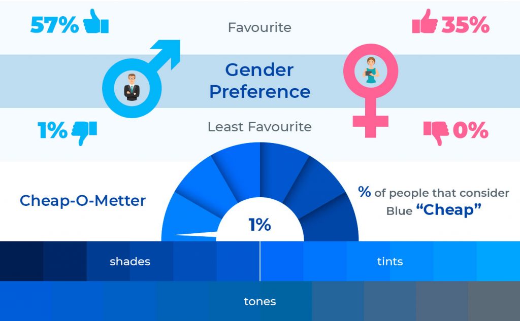
Another approach is somewhat more practical. Review 42 has released its statistics on the use of colors in marketing. According to research, 90% of first impressions are color-related.

img source: personal image
But this approach is not optimal, either. Any web design courses will teach you that every person perceives colors differently, and there is no guarantee that your customers’ preferences will match the overall statistics. Looking ahead, we will say that, even based on the recommendations that we will give in this article, it will not work to create the perfect creative design that everyone will like. You can only bring the result closer to the most effective one.
For example, statistics say that 57% of men prefer blue. It would seem a perfectly logical reason to create a website in blue. But! The same statistic says that among women, only 35% will appreciate this web page design. Of course, this is not critical if your target audience is men. But what if the sex is mixed?
img source: personal image
The most practical and most common approach is to develop the site theme. A modern person has already formed strong associations linking a specific business niche with specific colors. If you create a website based on existing associative chains, the chances of miscalculations are minimized.
Check out the artwork for The Vegan Kind Supermarket. The store specializes in organic products for vegans, so the site is decorated in the appropriate colors:
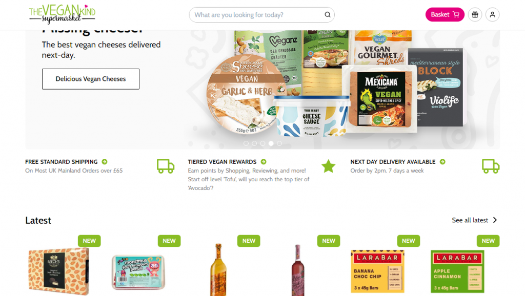
An unobtrusive white background, a green logo, and the same green buttons that emphasize the company’s direction.
The consumer will perceive the site even better if they choose not just a color scheme for it but create a corporate identity. Using the same shades in the logo, on the website, in advertising, and in various printing materials, you will definitely make your brand recognizable and memorable.
Any web page is composed of content and white space. Some areas contain nothing – no images, no text, no ads.
Competent distribution of white areas on the page relieves the user’s load, allows to take a break from the flow of information, and form his own opinion.
In this case, it is important not to go too far. You don’t need to make huge gaps. This will alienate the client. Instead, distribute your content so that it doesn’t clutter up the entire screen.
Here is what you or your web designer need to do:
As a result, instead of a solid monolith of information, the user gets variety. And the spaces between the elements are the white space that allows you to rest and comprehend what you read.
Take a look at the Squarespace web studio website:

Please note: white space is logically distributed across the page. The blocks are arranged to focus attention in the upper left corner. Due to this, the visitor first reads the slogan-call, then lowers his gaze to the web page, and only after that starts reading the accompanying information.
Imagine visiting a new site. Everything is unfamiliar to you, but you are trying to quickly navigate to find the information you need. Will the complex interface please you? Obviously not.
The less cluttered the site with various blocks and elements is, the better it manages attention. It is important that the user can quickly find what he needs. At the same time, there should be enough information to understand what the company does and what it offers.
This does not mean that everything that is on your site should be put on the menu. Too many navigation buttons will only confuse people.
Instead, think about the items that will interest the client first. Here are some tips:
A user-friendly interface is one of the kind of all online casinos distinguishing features. High competition and a similar combination of portals force the company to gain increased visitor’s reactions, making their stay on the site as comfortable as possible.
Take a look at All British Casino website:
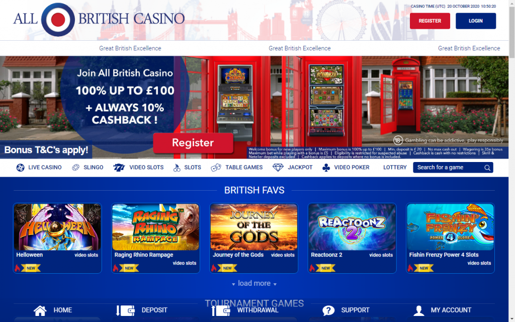
The user immediately sees examples of available games and categories existing on the site. The banner announces current promotions, prompting a profile’s creation, and the bottom menu provides access to the most important sections.
Pay attention to the registration and authorization buttons. They are placed on the white area mentioned above. They immediately attract attention and are always available – no matter what moment the user decides to enter or register, he will easily find where to do it.
If you are not sure how to design a site in the best way, visit other companies’ portals. Imagine yourself in the user’s place and evaluate which solutions are successful or not very good.
It is advisable to check the interface for convenience before putting the site into operation. If you cannot abstract and be unbiased, hire testers or use a UX designer’s services.
Animated elements are another effective way to retain attention. Imagine that you are armed with a laser pointer and are trying to control a cat. You can do the same with animation: create flickering or pulsing buttons that you just want to press.
This is confirmed by the CopyBlogger portal research. It says that animated buttons give 45% more clicks than the same but without animation.
Animation can be used not only in buttons. Using web design software, you can create dynamics in design elements when scrolling or hovering. This way, you not only bring the static picture to life, but you can also capture the user’s eye on what you want to show him. Bunny boiler is a great example of fantastic animation.
Animation also helps to relieve space. For example, here’s how the site of the Reliable design team did it:
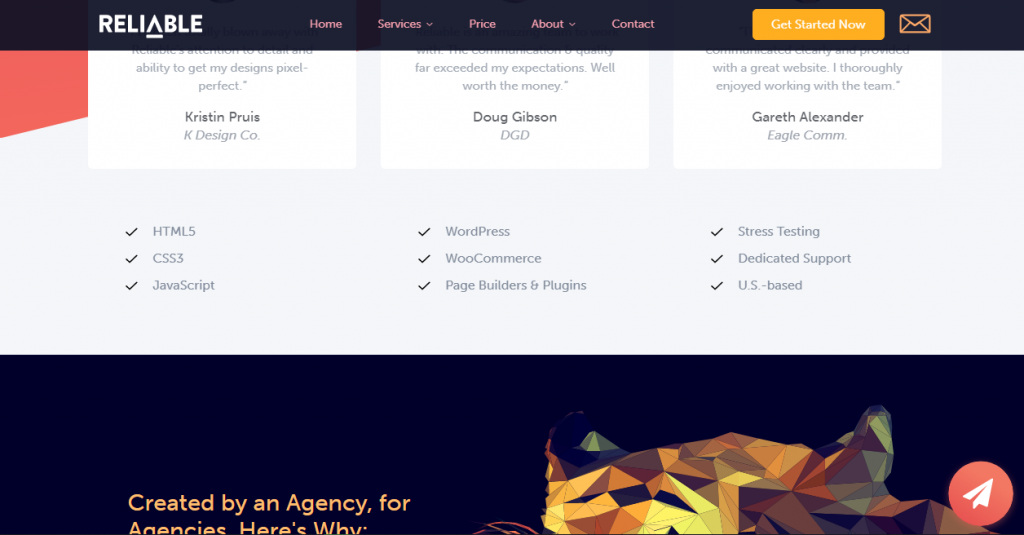
The top menu only appears when scrolling up. When the user is exploring the site and viewing the content, the navigation bar does not distract him. Space is used as efficiently as possible, and the site looks great on devices of any screen size. At the same time, the user does not need to perform any complex actions to bring the menu up.
This is much more convenient than hiding the navigation behind an ellipsis button. In this case, the user does not need to click anything. Just turn the scroll wheel a little.
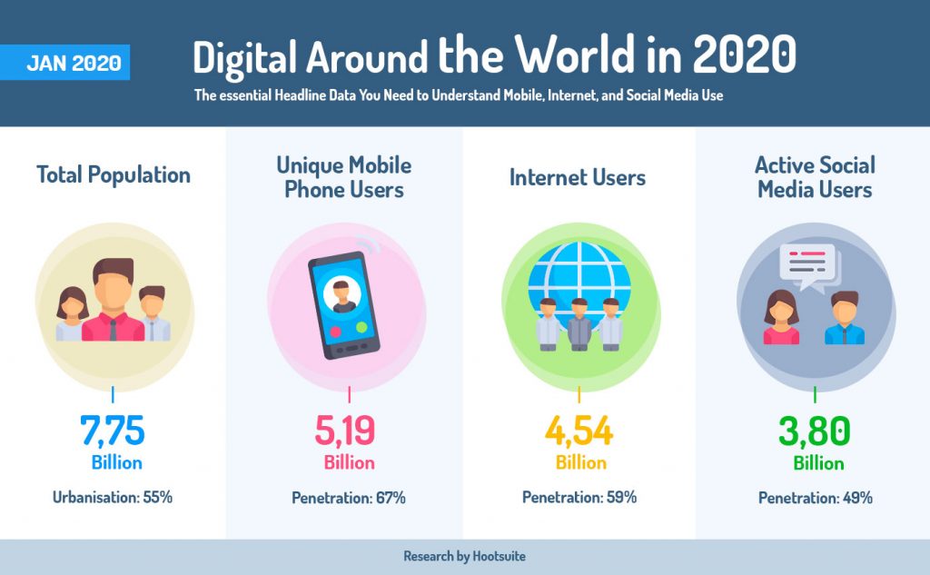
According to statistics from DataReportal, in 2020, 67% of the population use mobile devices. Therefore, it is extremely foolish to create a website focusing only on displaying in a browser on a PC.
Pay attention to the interface of the mobile version. Any person should easily find the necessary navigation buttons and, at the same time, not be distracted from the main content.
The right solution is not a superficial adaptation but a thorough study of the mobile version. It is necessary to think over what and in what order you should arrange. You may have to drop some items or shorten the menu. Focus on what needs to be shown first.
It is also worth considering the difference in internet speed. Do not overload the mobile version with complex elements and heavy graphic files. Make sure that your site opens quickly, regardless of device performance and data transfer speed.
If people have any questions, they must quickly find answers. Try these tips on buttons:
These elements will not only help you find a solution but also stimulate communication. The user is much more likely to contact a live chat than to search for answers in the depths of the site.
Take a look at the support section of the popular WebinarJam webinar service:
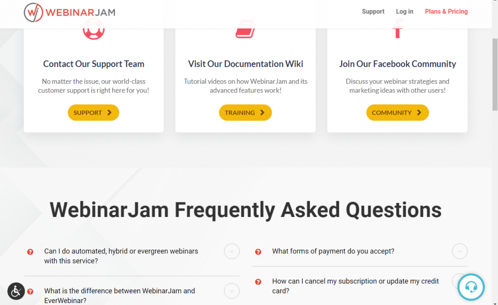
The eyes are immediately focused on the proposed functions: contacting technical support, the help center, and the official Facebook page, popular questions are displayed in a separate block at the bottom, and in the corner of the page, there is a live chat button. The user does not need to navigate from page to page in search of a consultant – everything is near and at hand.
We’ve given six responsive design tips to help you increase conversions and sales on your website. It is impossible to describe all the subtleties and nuances in one article. Therefore, first of all, we focused on examples of the most successful solutions.
If you are not sure that you can freely think about the smallest detail design, it is better to contact a specialist. But even one of our recommendations will already help to increase the efficiency and profitability of the site.
Most importantly, remember to evaluate the changes from the user’s point of view. Put yourself in his place and check how convenient it is to use your site. Get help from friends and acquaintances to get web design inspiration. They will give you an unbiased assessment and suggest weak points.
Thomas Glare is a passionate freelance content writer, always striving to inspire others and bring insight into the endless possibilities of the modern times we are currently living. He continues to improve his knowledge and is the co-designer of a “Germany mr bet”.
Read More About Thomas GlareTalk to a knowledgeable product specialist to learn more about your requirements and ensure PayKickstart is the perfect fit for your needs.

 Ann Smarty