
Subscription growth hack (by PayKickstart)
Facebook Group - 3,932 members
Visit Group
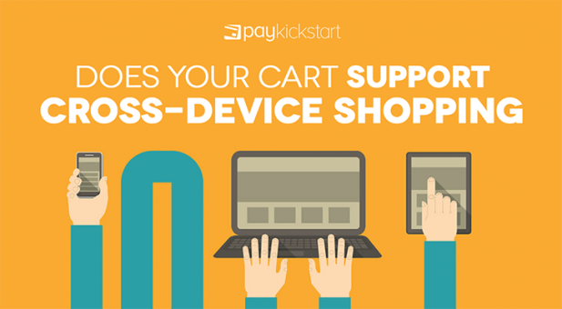
Think about how many electronic devices the average consumer now has access to and can use for shopping. There’s smartphones, laptops, desktops, tablets, smart watches and more. And these days, many people mix in their devices during their customer journey.
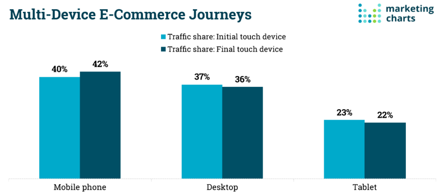
Consider that 4o percent of customers start their journey on a mobile device while 42 percent ultimately end their journey on said device. Meanwhile, 37 percent start their journey on desktops while 36 percent end on them. These numbers suggest that people use multiple devices while shopping. And often, people end their journey with a different device.
That’s why it’s important to use a shopping cart that supports cross-device shopping. This way, people will be able to easily and conveniently check out, no matter the device they’re using. And if you fail to offer a cross-device shopping cart, you may miss out on sales and lose customers.
Let’s take a look at how online shopping has evolved and why supporting cross-device shopping is so important.
Long before smartphones came along, the PC and Internet shook up the retail industry. Consider that 40 years ago, the Internet wasn’t even publicly available and still in the early stages of development. Now, Amazon and online orders are ubiquitous and just about everyone is using the web to have goods delivered. In fact, 1.6 billion people globally shopped online in 2017.

At first, people used personal computers for all of their online shopping needs. Then, Steve Jobs unveiled the first iPhone, ushering in the era of smartphones. Soon, Android emerged on and within a few years it seemed like everyone owned a smartphone.
In fact, 81 percent of Americans own a smartphone and increasingly they are using those devices for shopping. Take Black Friday 2018, for example. Online sales in the US alone topped $6.2 billion with $2.1 billion coming from smartphones and several hundred million more coming from tablets.
In other words, PCs have been losing their stranglehold on online shopping with more people opting to use their mobile devices. This has spurred the development of apps, mobile shopping carts, and more. However, it’d be a mistake to focus only on mobile devices (or PCs). You need to cater to each device, and importantly, each screen.
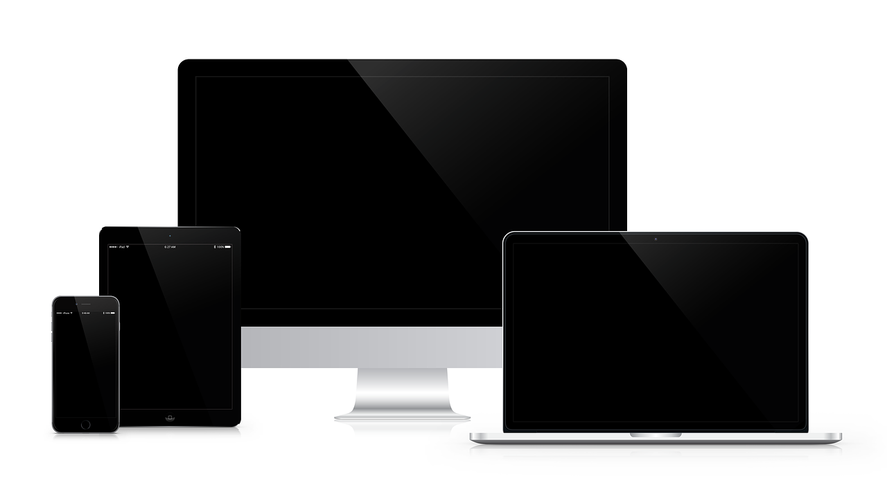
You need to cater to multiple screen sizes and input methods.
Why? Not only are different people using different devices, but a lot of people are using multiple devices while they shop. Let’s take a look at what that means.
Let’s say you’re looking for a new TV. You might be bored during your lunch break, so you pull out your smartphone and start doing some research. After work, you might grab your personal laptop and do a bit more in-depth research. Later that night, you find yourself lying in front of the old TV, playing with your tablet, when you decide to pull the trigger.
Point is, a customer’s journey can be more complex and convoluted than ever before. And no matter the device your customer is using, you need to offer them a secure, and easy-to-use shopping cart. Whether your customer is using a smartphone, desktop, tablet or whatever else, checkout must be as straightforward as possible.
Make it difficult for customers to check out and they’ll be more likely to abandon your cart. With shopping cart abandonment rates reaching as high as 80 percent, it’s essential to do whatever you can to lower abandonment. That’s why a cart that supports cross-device shopping is now essential.
Can’t your customers simply use your standard website from their mobile, tablet, or whatever else? Technically, yes. However, using a mobile device to access a traditional website can be very inconvenient. While a laptop or desktop has a large screen, keyboard, and mouse, a tablet or phone will only have one small screen. Further, all input will be through touch.
Clicking on the links and buttons found on a traditional website can be very difficult. That’s why many websites now offer mobile friendly websites that are optimized for small screens and touch input. Your shopping cart must likewise be optimized for a smaller screen.
Likewise, mobile websites often don’t look good on larger screens. And since they are optimized for touch use, if you don’t have a touch screen, mobile sites can be more difficult to use. Check out the difference between PayKickstart’s website when viewed from a mobile device and desktop.
Desktop:
Mobile:
Ultimately, over 70 percent of customers want a mobile website and nearly 95 percent judge websites based on their responsive design. You can bet that people using desktops likewise want desktop optimized sites. So if you don’t offer both, you will be disappointing many of these customers.
Does it sound like catering to multiple devices is a pain? In many ways it is, but there’s an important silver lining…
While catering to multiple devices can be a pain, there’s an important advantage: multi-device customers may actually be more valuable than single device customers. Monetate has found that multi-device customers outperform single device customers in the following ways:
Why should this be the case? Most likely, the customer is both more motivated in making a purchase and more interested in your product specifically. If a customer is pulling out their smartphone, laptop, and other devices to constantly look at a product, it’s probably because they’re quite far along in the purchasing process and have a high need for the product or services offered.
Now you know that more customers are using mobile devices and multiple devices while shopping. And when it comes to multi-device shoppers, they can actually be more valuable than single device customers.
The implied conclusion should be pretty obvious: you need to support multi-device shopping. That means having a website that is both PC and mobile device friendly. It also means having a shopping cart that is easy to use, no matter the size of the screen and the type of input used.
If your shopping cart does not support cross-device shopping, you need to ditch it for one that does. Even if your cart does claim to support cross-device shopping, you should take some time to review how easy the cart is to use on different size screens. Some shopping carts aren’t easy to use on mobile devices even if they claim to be mobile friendly.
Either way, make sure your website and cart cater to customers no matter the device they’re using.
Michael Harbone is an experienced copywriter, writing professionally since 2017. He has written for multiple digital marketing companies gaining the reputation for writing engaging, concise articles one which received an award from Upcity.
Read More About Michael HarboneTalk to a knowledgeable product specialist to learn more about your requirements and ensure PayKickstart is the perfect fit for your needs.

 Ann Smarty