Subscription growth hack (by PayKickstart)
Facebook Group - 3,932 members
Visit Group
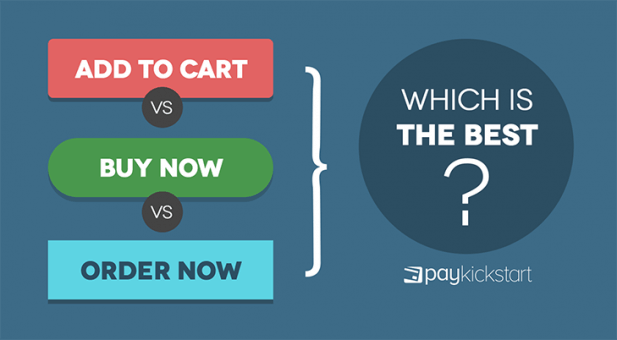
What’s the big deal? They’re all phrases that pretty much mean the same thing – right?
At first glance that’s true.
All of them tell a visitor the button they’re about to click will initiate a transaction but each has a different effect on the person viewing it.
Add to cart, in many situations, means something completely different than buy now and order now.
If you get it wrong, it can have a marked impact on the number of people who complete a purchase.
But, how do you know when to use each one for maximum impact?
In this post, you’ll learn the nuances of each phrase and when they should be used to get more people to take your desired action – making a purchase.
Think about how people shop online and offline.
A person goes into a department store or website with the aim of getting a specific item. They may have already decided on it or be on the hunt for more information.
In either scenario, they’re actively considering a product to buy.
They find it and instead of heading directly to check out, they put it in their basket or shopping cart. While walking through the aisle or clicking through pages, they may see a few other items that catch their eye and also add it to the cart.
By the time they get to the checkout, they’ve decided on one or two items and are on the fence on about the rest.
At this point, they’ll either get everything or put a few items back.
Adding an item to the cart isn’t a guarantee that they’ll buy it. It just means they’re considering it.
If, on the other hand, they’re on a website or even a store that only has one item, there’s no need for an add to cart button because there’s nothing else to shop or consider. Once you pick the item, you’re checking out immediately.
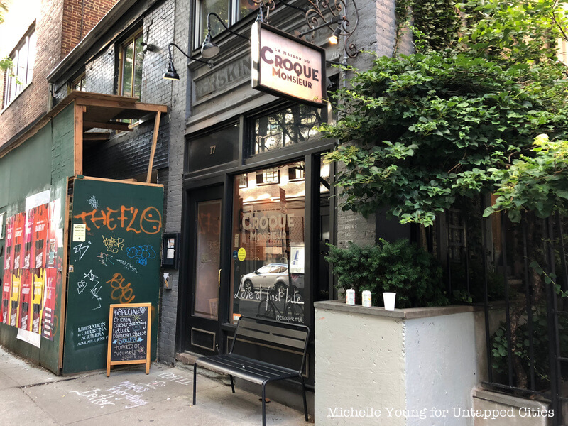
Though more common online, there are a few offline businesses that only sell one item such as La Maison Du Croque Monsieur (The House of Mr. Crunch). All it does is serve a toasted French sandwich called Croque Monsieur.

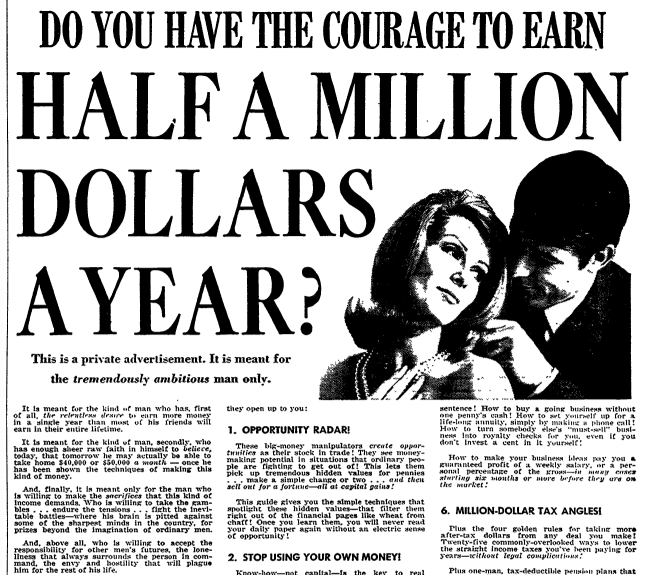
An order now button is reminiscent of the era of direct mail copywriting when people like Joe Sugarman and Gary Halbert made millions.
There would be a long print ad that captured attention and got cold audiences to fill out a form and mail it in to order now.

Though not visible here, there’s an order form at the bottom of this advertisement. On a side note, this ad pulled like a mofo.
Moving on.
As you can see, different phrases compel people to behave in different ways. Let’s look at the context where you’d use each one.
Add to cart has two things going for it:
When people click add to cart, they’re signaling that they’re interested in the item but may not have committed to buying it. It’s in the cart and saved for them so there’s no pressure – they can continue shopping.
This is ideal when you have multiple products on your website and each can be purchased separately. For example, you have multiple bags and accessories on your website that complement each other.
Instead of having a buy now button, it may be a good idea to allow users to add to cart and continue their shopping. This leaves the doors open for an increased average order value.
A member of Warrior Forum ran an informal experiment and found that “add to cart” was the most successful phrase for increasing conversions.
The downside of the add to cart button is that people may be on your website for an extended period of time and forget they’ve added items to the cart. It happens.
You can cut down on this by using popups that remind them about their cart items when they want to leave your website. Another method you can use is designing the cart to show people how many items are inside and even adding an animation that makes the cart shake every few minutes.
Of course, you want to test these elements so they don’t have a negative impact on your conversion rates. Every group of shoppers is different so it’s important to figure out what works in your particular situation.
There’s interesting psychology behind the buy now button.
People, by their very nature, are prone to make impulse purchases.
Have you ever been in a Sam’s Club, tasted a free sample, and ended up buying it? That’s a combination of reciprocity and impulse buying.
83% of millennials say they’ve made impulse purchases. I’d argue that the number is much higher.
Factors affecting the use of a buy now button:
When all of them are present, it increases the likelihood that someone will buy immediately.
This phrase is well suited to standalone products and services that are delivered immediately. For example, an Ebook, software download, training material, etc.
The order now phrase is similar to buy now in that it’s ideal for standalone products. The difference is that there’s an association with longer wait times. Maybe the item needs to be prepared or shipped to them so even though they’re paying now, they won’t get it immediately.
If you sell a limited range of products that need to be shipped or otherwise prepared for your customers, an order now button sets the right expectations.
There are no hard and fast rules when it comes to choosing the best button text.
At most, there are best practices.
This article has looked at three button phrases:
For each of them, I’ve laid out how they work and why, as well as specific situations where they may make sense. Use the information in this article as a starting point for your own experimentation. You may get a completely different result which is OK.
Let me know what you think about button phrases in the comments and don’t forget to share.
Daniel Ndukwu is a regular contributor to the PayKickstart blog. He has extensive experience with online businesses, conversion optimization, and subscription revenue models. When he's not writing insightful content, he works with other entrepreneurs to help them grow their bottom line.
Read More About Daniel Ndukwu