Subscription growth hack (by PayKickstart)
Facebook Group - 3,932 members
Visit Group
Over the next few days, we’ll be revealing some of the biggest and best feature updates to PayKickstart that we’ve been working on over the past couple of weeks.
Though there are several features we added because of our own experience and results as online entrepreneurs, the majority of the features that have been added are ones that YOU as PayKickstart sellers have asked for.
When YOU ask, we deliver. As PayKickstart sellers, you are the ones driving this shopping cart, selling machine. So Thank You for all of the requests! Please Keep them Coming!
I just love this community and it’s only going upwards! You can submit your requests and check out what’s on tap for future releases here. 🙂
Today’s post is going to focus on the single most influential page when selling your product and the easiest way to increase your sales conversions: The Checkout Page.
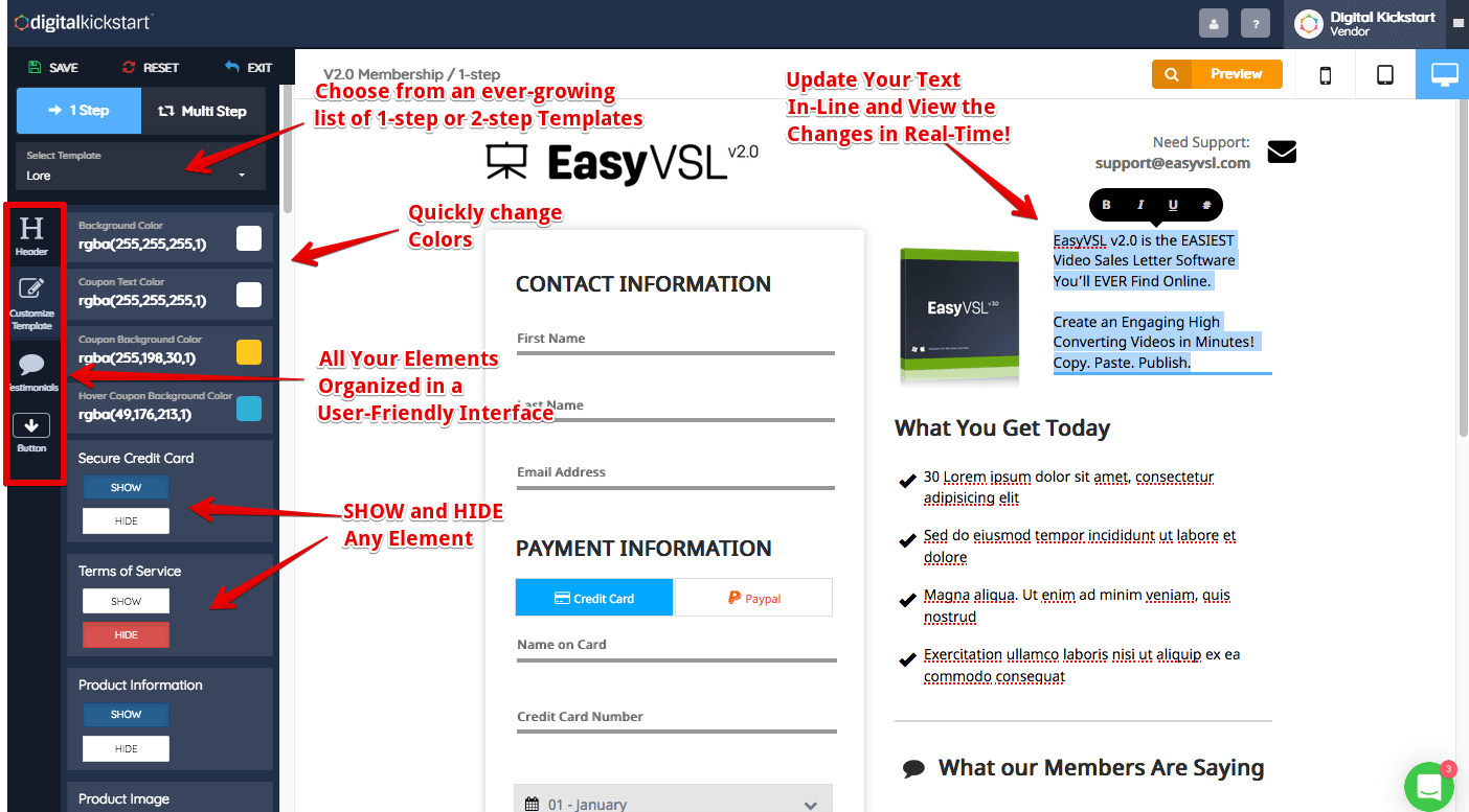
The New Checkout builder now allows you to edit nearly 99% of the entire checkout page so that you can customize it to your company, brand, and product.
Step 1. Choose a Template.
Step 2. Start Customizing with the In-Line Editor.
Change Colors, Background Images, Text, Logos, Testimonials, Product Images, Add Custom HTML code for tracking … you name it!
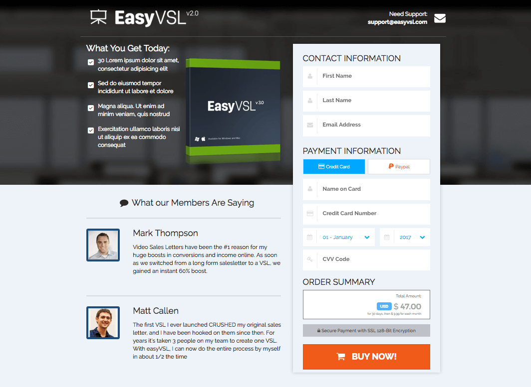
One of the biggest requests were checkout templates that would allow for Testimonials and/or product images.
So that’s what we’ve done for you!
Adding Testimonials alone to your checkout pages can instantly increase your conversions by 30%!
Crazy, huh? Now, adding that single element can be done in less than 30 seconds. Here are the latest beautiful designs that you can access from your PayKickstart checkout editor.
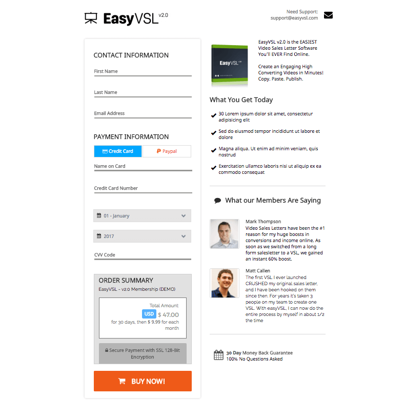
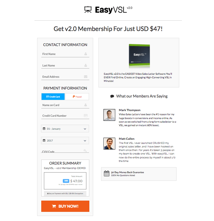
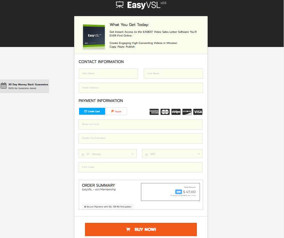
This one one of our core features in the initial release of PayKickstart for one simple reason…
THEY CONVERT!
With our latest release, you can now setup One-Click Upsells while still using a Checkout Popup Widget for your frontend product.
How do you set it up? Easy. Just create a funnel for your products (frontend product and as many upsells/downsells as you want). Choose the Checkout Popup Widget Embed as your checkout link option.
That’s it! The one-click upsell functionality will instantly be built in!
OH! Forgot to mention… YES, this works with PayPal and Credit Card! 😉
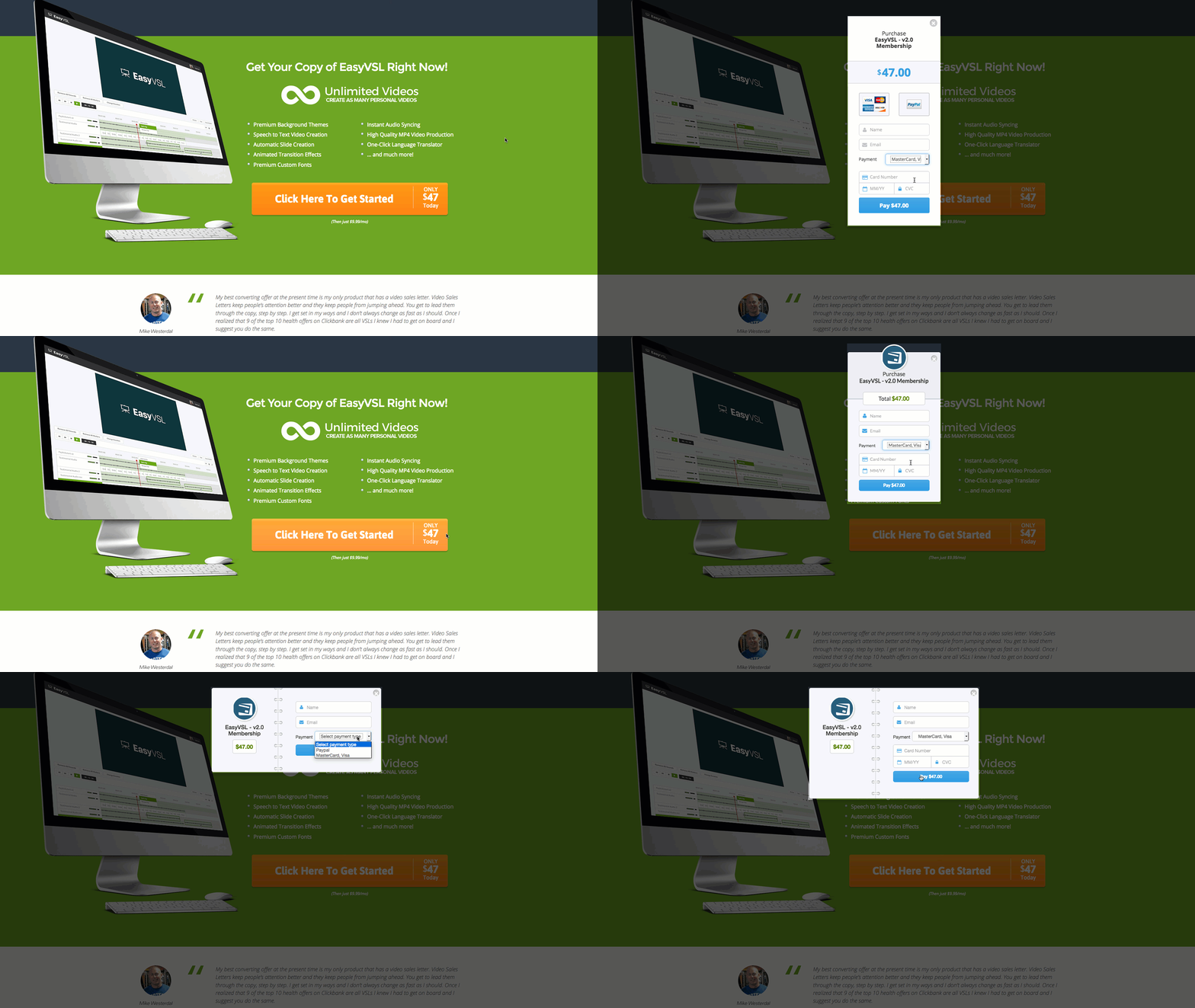
Embed these cute little checkout popups for ANY link, button, or image … on ANY website!
It doesn’t matter how you build your webpage, (doesn’t matter if your page builder is “integrated” with PayKickstart or not) … you can embed these checkout popup widgets on any webpage.
When someone clicks to buy, a sleek high-converting popup will appear for instant purchasing without ever having to leave the sales page.
Before this feature was available, users were required to use either our checkout page templates OR the checkout popup widgets.
NOT ANYMORE!
Build your webpage with ANY page builder or custom design of your own. Then copy/paste a PayKickstart checkout form embed right onto your page, inline with your custom-created content.
For instance, let’s say you are using ClickFunnels to create your pages. But you don’t want your customers to move away from your landing page. You want the entire design to be created with ClickFunnels and you want to sell your product right there on that page. Not a problem!
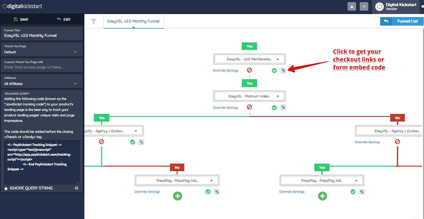
STEP 1: Go into your PayKickstart Funnels. Select the Product and Enable Checkout Form Widgets.
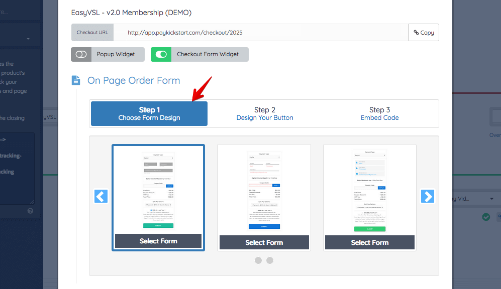
STEP 2: Choose from a handful of designs.
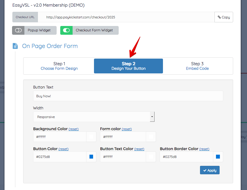
STEP 3: Customize the look and feel to your liking to match your page and brand.
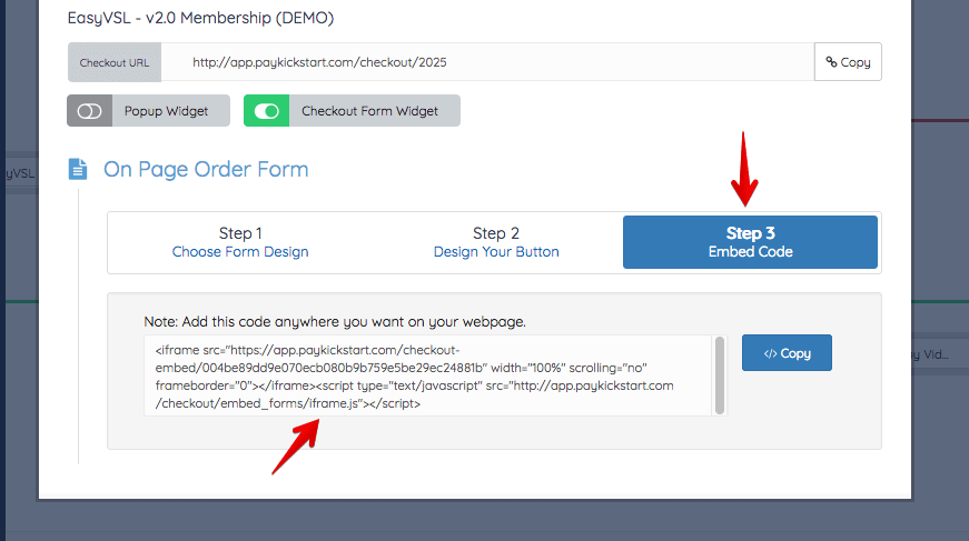
STEP 4: Copy the checkout embed code. Paste it onto your webpage. Done!
You don’t want to be strapped down and limited to only the designs of your shopping cart…
With PayKickstart… You (the seller) have complete control!
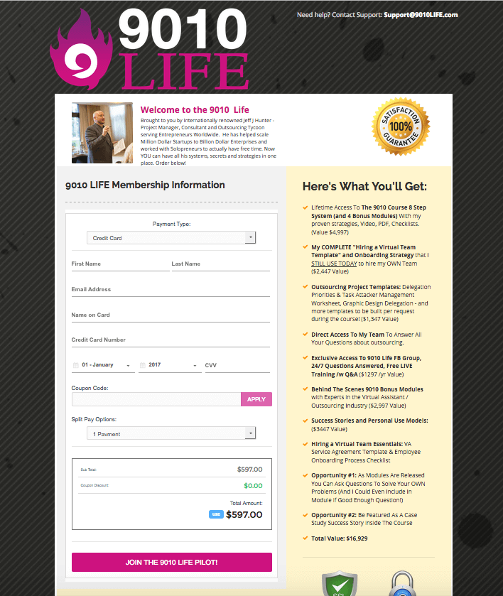
Here’s a nice example from one of our member’s checkout page, (Jeff Hunter of 90-10 Life).
The page was designed with his own page builder and he simply customized his checkout form to match his brand, copy/pasted onto his design… all DONE in a couple minutes.
When it comes to selling online these days, if your checkout page is NOT optimized for mobile devices… you’re guaranteed to lose sales!
PayKickstart is the opposite of most other shopping carts out there. You are sure to get MORE sales with our mobile-optimized checkout pages. 🙂
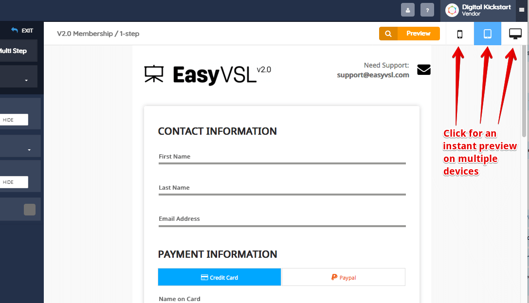
Inside the checkout editor, with one click, you can view how your checkout page will look on a mobile smartphone or tablet, in real-time.
Be on the lookout for our next update… We’re here to help you sell more, keep more, and profit more! Let us know how we can help!
Of course though, the first thing that will help you is a PayKickstart account. 😉
If you’re not using PayKickstart to sell your products, what are you waiting for? It’s free to get started today!
[cm_ad_changer campaign_id=”2″]
Matt Callen is co-founder of PayKickstart. He has founded several million dollar online businesses and lives in Indianapolis. Since 2006, he has helped hundreds of thousands of entrepreneurs scale and grow their online businesses with software and automation.
Read More About Matt Callen