Subscription growth hack (by PayKickstart)
Facebook Group - 3,932 members
Visit Group
We have seen it a hundred times: a customer has gone through your website, picked out a few items, are just about to make their purchase and… nothing. They have left their cart abandoned and another sale is left unmade. This spells disaster for SaaS businesses.
Nothing is quite as frustrating as those leads following through with browsing, only to change their mind at the last second. Why are they doing it?
What disconnect is occurring that makes them double think their decision?
Much of this phenomenon can be pinned on the psychology of consumers.
According to Cox Blue, a full 57% of shoppers are going to leave their cart before completing a checkout. Of those 57% of consumers, 80% of them will never make it back to your site.
That right there gives us some insight into their thought process; if they decide not to buy from you, a good majority will write off your website altogether. (Check out their awesome infographic for more useful info).
What are the biggest reasons this is happening? Baymard made a handy graph that gives us a full rundown, but the top five reasons are as follows:
All of the above statistics paint a clear picture for us. We might also be seeing a few issues that we are guilty of on our own site. Or maybe they are just vague enough that you aren’t quite sure of whether or not your site is putting them through the same thing. More on that later.
Now that we see the barriers for many of our customers at checkout, let’s look at how to get your SaaS buying process up to scratch.
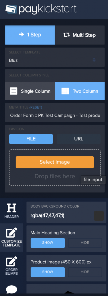
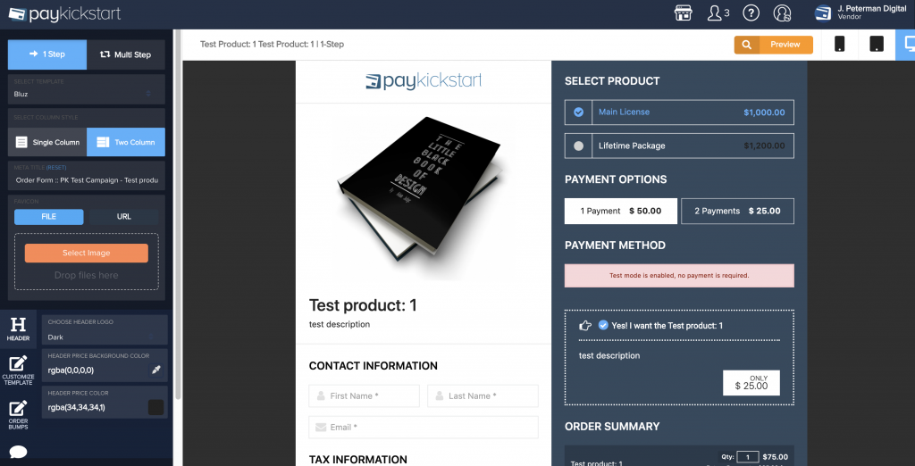
One big reason customers click away is the checkout looks terrible. You don’t want an eyesore, so make sure your screen is attractive and visually appealing. Add pictures and make them perfect.
You can upload your product image using PayKickstart’s Checkout Page Builder:
In B2B, free shipping is becoming a must to make it out there. Instead of charging shipping costs, businesses build those costs into the price of the item. If customers want faster shipping, they can pay higher rates by choice.
When it comes to SaaS, don’t add up any processing fees, any service fees, etc. Whatever you can build into the package price, do it.
No checkout should be taking more than a minute and a half, max, to complete. You want a fast and seamless process that allows the customer to see their times, input their information and processing.
Want your customer to create an account? Once the checkout is over, offer an option to make an account on their confirmation screen. Including something like, “This order is worth X points, sign up today!”
The checkout page should have all costs right there, easy to see. If the customer can’t see those costs up front, they are more likely to change their mind.
A great way to get an account set up, allow customers to use social media or Google. SaaS companies can especially benefit from this.
There should be two checkout buttons on your page, on at the top and one at the bottom.
Some customers may have already made up their mind and want to do things fast, especially if they are retained customers and their payment info is on file.
Amazon is a great example of this. Instead of going to different tabs, everything from payment to shipping to final cost is right there on a single page.
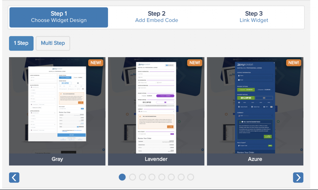
Set up Checkout widgets that provide the fastest checkout experience: No need to leave the current page to pay!
Online security is a huge issue and more and more customers become aware of it becoming and more proactive with keeping their information secure, as Hari Ravichandran explains.
Make sure your customers know you are taking this issue seriously.
On the bottom of the payment section, show off the different buttons for accepted credit cards and a safety seal icon.
Allowing your customers to call, and listing a toll-free number on your page will also help your customers feel more confident with your site.
Including a phone number always helps your customers feel more secure as your business looks more “real” when it can be instantly reached via the phone. If you think this is not something you can afford, try opting for UCaaS which is affordable and can help your business be more accessible.
Not everyone is ready to commit. So why not have a wishlist or saved product feature that they can come back to later?
A day or so after a cart has been abandoned, if you have the customer’s email send them out a reminder. If they still don’t come back after a week, send another with a survey asking for their reasons and any feedback they may have.
PayKickstart’s pre-built cart abandonment emails are sent out automatically. You can customize each template using dynamic customer and product details allowing you to personalize each email.
Have a quick description of the item in the cart for them to go over to make sure it is right. SaaS brands can make a quick rundown of features included in their choice.
PayKickstart’s Checkout Page Builder gives you an easy way to design the shopping cart experience that is includes all the details while providing smooth experience:
A lot of SaaS websites have reviews on the front page, or a separate page. That’s fine, but I have found it more effective on the product page, since it is where they are deciding on whether to sign up.
Anyone with an app should have in app purchases to renew, add features, buy products, switch account types, etc.
Some people will be on computers, some on tablets, some on smartphones. Have an adaptable website so you don’t lose out on business.
Further reading: Is Your Checkout Page Flawless on Mobile Devices? Here’s How to Check
Do you have any tips on SaaS cart abandonment? Let us know in the comments!
Ann Smarty is the co-founder of Smarty.Marketing, an SEO agency specialising in AEO/GEO, digital PR, and Reddit marketing. She is the former Editor-in-Chief of Search Engine Journal and a contributor to prominent search and social blogs, including Small Biz Trends and Mashable. Ann is also a frequent speaker at Pubcon and the host of a weekly Twitter chat #vcbuzz
Read More About Ann SmartyTalk to a knowledgeable product specialist to learn more about your requirements and ensure PayKickstart is the perfect fit for your needs.
