Subscription growth hack (by PayKickstart)
Facebook Group - 3,932 members
Visit Group
Just like your body language is a reflection of your personality, landing pages represent how credible a brand is and help to demonstrate the usefulness of your products or services. They are designed as standalone web pages, designed specifically for getting leads or conversions. Landing pages can be compared to a date that the user has with the brand. It can either be a memorable one, that makes them look forward to meeting you again and again or a boring one, that would lead them to ghost you.
To make sure that your landing pages fall in the former group, visuals can be the safest bet for you.
However, before delving deeper into the visual part, let’s discuss the “WHY” of landing pages.
If you create a landing page optimized for search engines, it will leave an impact on the algorithms and help you drive the right target audience.
Having an impressive landing page can help you capture leads, thereby contributing to the increased conversions and ROI in the long run.
If you want to introduce a new product in the market or promote a service that you offer, you must definitely create a landing page that informs the visitor about the benefits and unique value proposition.
Having discussed the benefits of landing pages, we shall now move on to how you can add visuals to the landing pages and garner maximum conversions for your business.
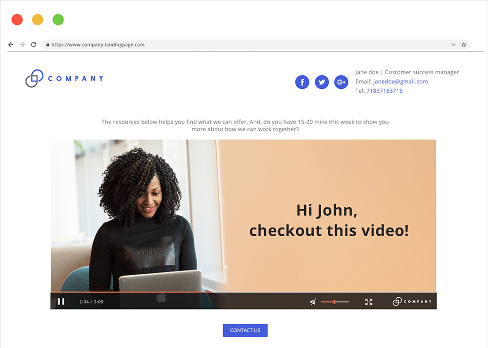
The first step to creating a visually rich landing page is an easy navigation. More often than not, your landing page will have a checkout button or a CTA button that redirects the visitor to the checkout page. You can use a robust tool like PayKickstart that allows you to embed the checkout tab directly on the landing page for better conversions. Besides, you must also aim to have a seamless layout and design so that there are no distractions for the user. Show your security seal and SSL certificate along with customer testimonials and reviews without fail, to build confidence in the prospect’s mind. If you are a vendor looking forward to garnering maximum conversions from your landing page, always include your USPs, high-resolution images of the product you are dealing with, and the entire product summary along with detailed shipping methods. In case you are a SaaS business owner, you can also have a video explaining the usage of your product or services.
In addition, you must also highlight the availability of the product with a user-friendly interface for smooth checkout and payment. It is advisable to have the checkout button at the top as well as the bottom of the page for better usability. Last, but not the least, include the contact information in your landing page design so that people can reach out to you without any hassles.
It goes without saying that apart from engaging text, your landing pages must have relevant and visually appealing images to support the copy. To make the images more impactful, you must add visual cues to the photos that would prompt the subscriber to take the next action. You can either use arrows or the eyes of the subscriber to direct the user to the CTA.
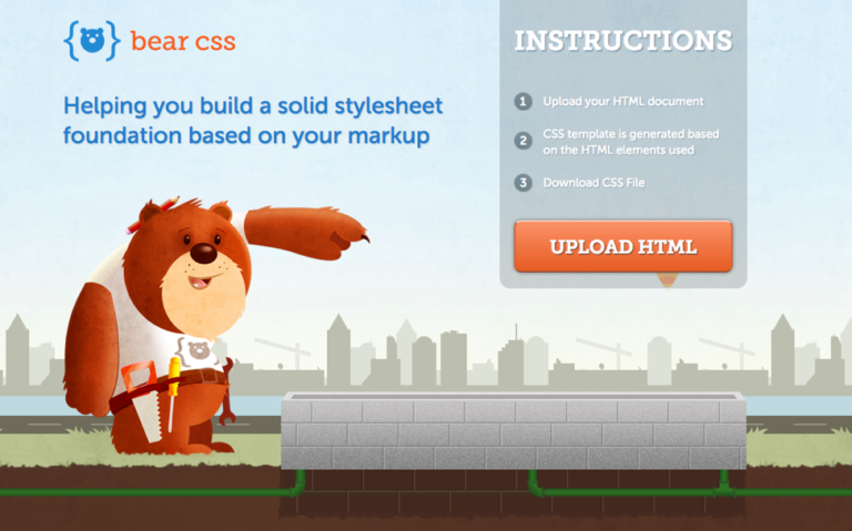
See how Bear CSS has designed a quirky landing page with the bear pointing toward the CTA button.
Images not only help to build your brand reputation but also help to showcase your offerings in a better way. You can even use images to tell a story to the visitors.
For instance, Moo sends out an email with an animated toaster and the CTA “Push the lever”.
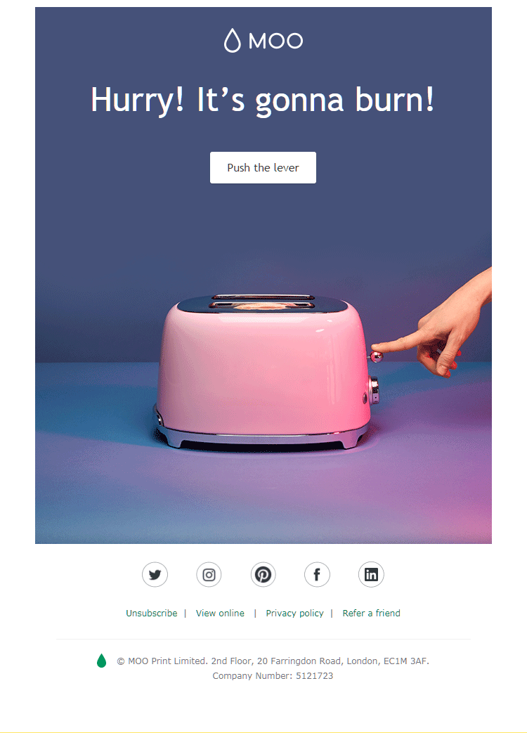
When the email recipient clicks through the CTA, he or she will be redirected to the landing page that shows a popped toast promoting their 15% off sale.
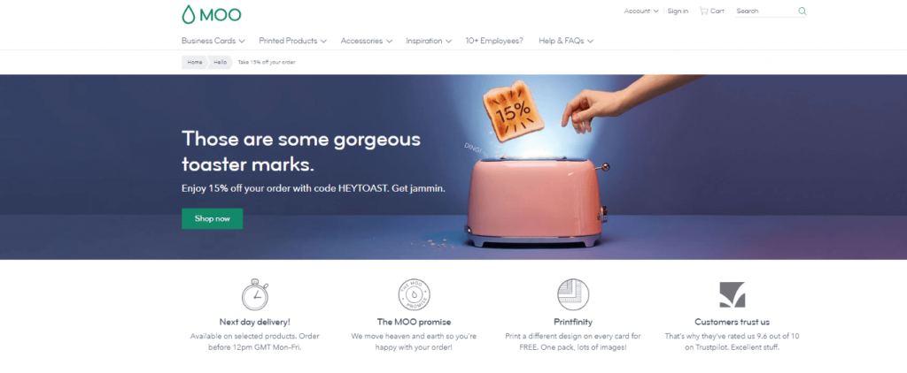
Now, that is a great way to engage your subscribers and make them take the next action even during slow months or slack season.
It is a great idea to use images of real people if that matches your brand personality and industry type. If you are a travel company that organizes trekking and hiking trips, you can have real images of people who have trekked with you on the landing page to gain the visitor’s trust and inspire them to travel with you. (Of course, you must seek the individual’s explicit permission before using his or her image.)
Avoid using stock photos as they would leave a negative impression on the subscriber’s mind putting your credibility at stake.
Often, it so happens that you want to explain about your product or services to the landing page visitors. In such a scenario, instead of using the great wall of text (pun intended), you can simply include explainer GIFs that would help you simulate a video-like experience. According to GIPHY, one of the largest communities for sharing GIFs, over 500 million active users spend close to 11 million hours checking out GIFs on their platform. This reflects how popular GIFs are.
Just make sure that your GIF is not distracting for the visitor but reinforces the usefulness of your offerings. Keep the GIF file size under 1MB as you would not want your landing page to take too long to load.
If you want to draw attention to the object in the foreground, you can consider two-tone gradient backgrounds on the landing pages. It will keep the visitor focused on the foreground while adding a sense of oomph to the landing page. Try it out like Whimsical has.
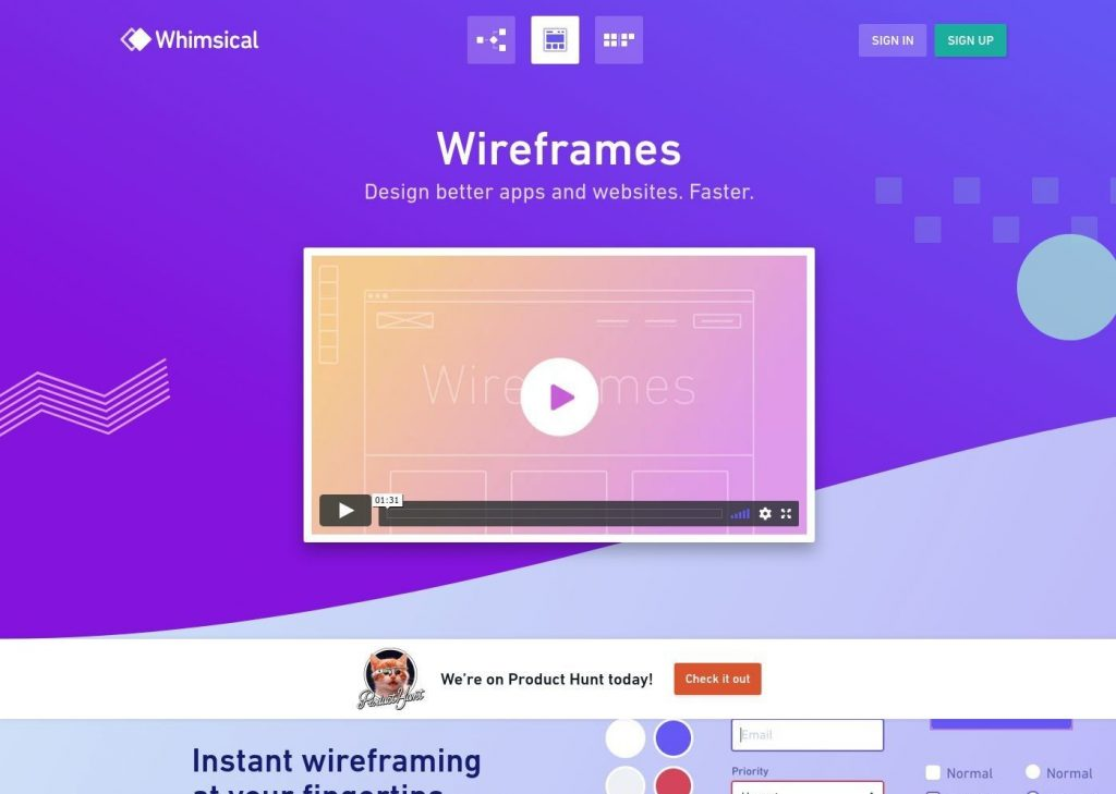
Here’s another landing page by Whimsical, that’s simple and makes beautiful use of geometric shapes too, in the background.
Talking about visuals in landing pages would not be complete without mentioning the importance of white space. A cluttered landing page would hamper the decision making power of the visitor and ultimately lead to “no conversion”. As seen in the example of Whimsical’s landing page above, white space gives breathing space to the visitor and encourages them to take action with a short three-fields form.
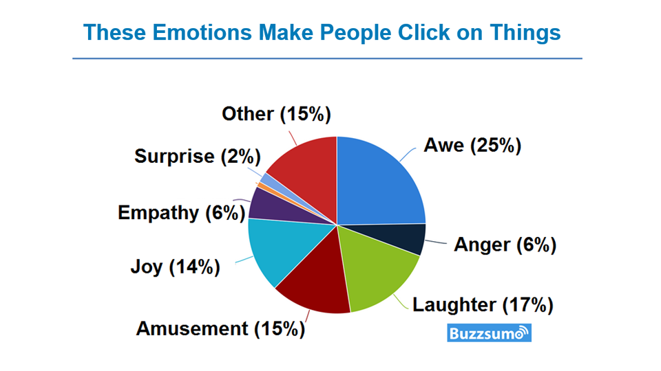
By using videos, you can increase your conversion by 86%. However, this is not possible unless the video impresses the visitors. Video landing pages are great for businesses that offer a complex product or service. They can convey enormous information without taking too much space or time. The visitors can simply watch a video and get all his or her questions answered. It will also reduce the objection bias as it demonstrates the benefits of using the product much more effectively.
Besides, video landing pages are great to entertain the prospects as they are likely to have a positive response to emotional instincts.
Here’s a pie chart to help you out.
While many businesses, especially SaaS companies have chosen video landing pages, some others have also gone a step ahead and incorporated personalized video landing pages to build stronger relationships with the visitors.
You can use tools like Hippo Video and Vidyard to create such landing pages. You only have to create a video template with a placeholder frame and you will be able to personalize it for your subscribers. It will make your subscribers feel that the video is created exclusively for them and increase the possibility of conversion.
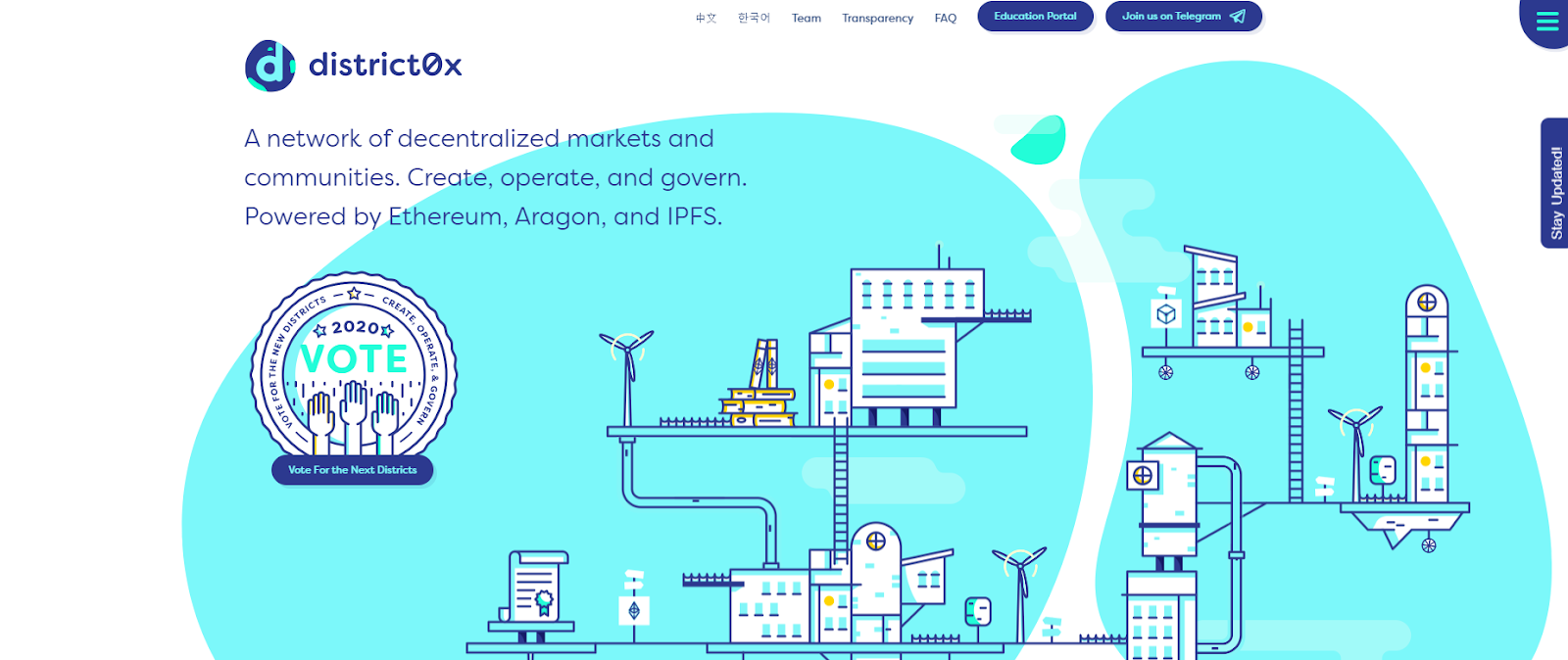
Illustrations work as graphics that can help the visitor visualize your business concept in a better way. Rather than investing time in a professional photo-shoot or video recording, illustrations are a more convenient way of communicating your message to the visitors.
Here’s a wonderful example by district0x that employs the perfect combination of illustrations and GIFs supported by a concise copy. Also, notice the ample white space as you scroll down the landing page.
View the landing page in action: Click here
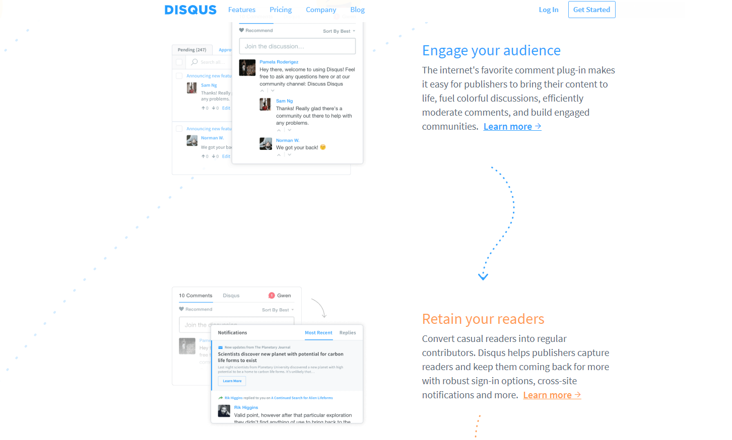
If we consider the scanning pattern of the visitors, most of them follow a ‘F-shaped’ pattern as shown in the image below.

Therefore, you will facilitate better scanning if you place your landing page content in a zig-zag layout.
Disqus uses a zig-zag layout displaying real screenshots accompanied with relevant text to let the subscribers know what they have got to offer. Take a look.
Statistics is the most boring thing to read on a landing page. To make it interesting, you can present the information in the form of graphs like SurveyMonkey has done.
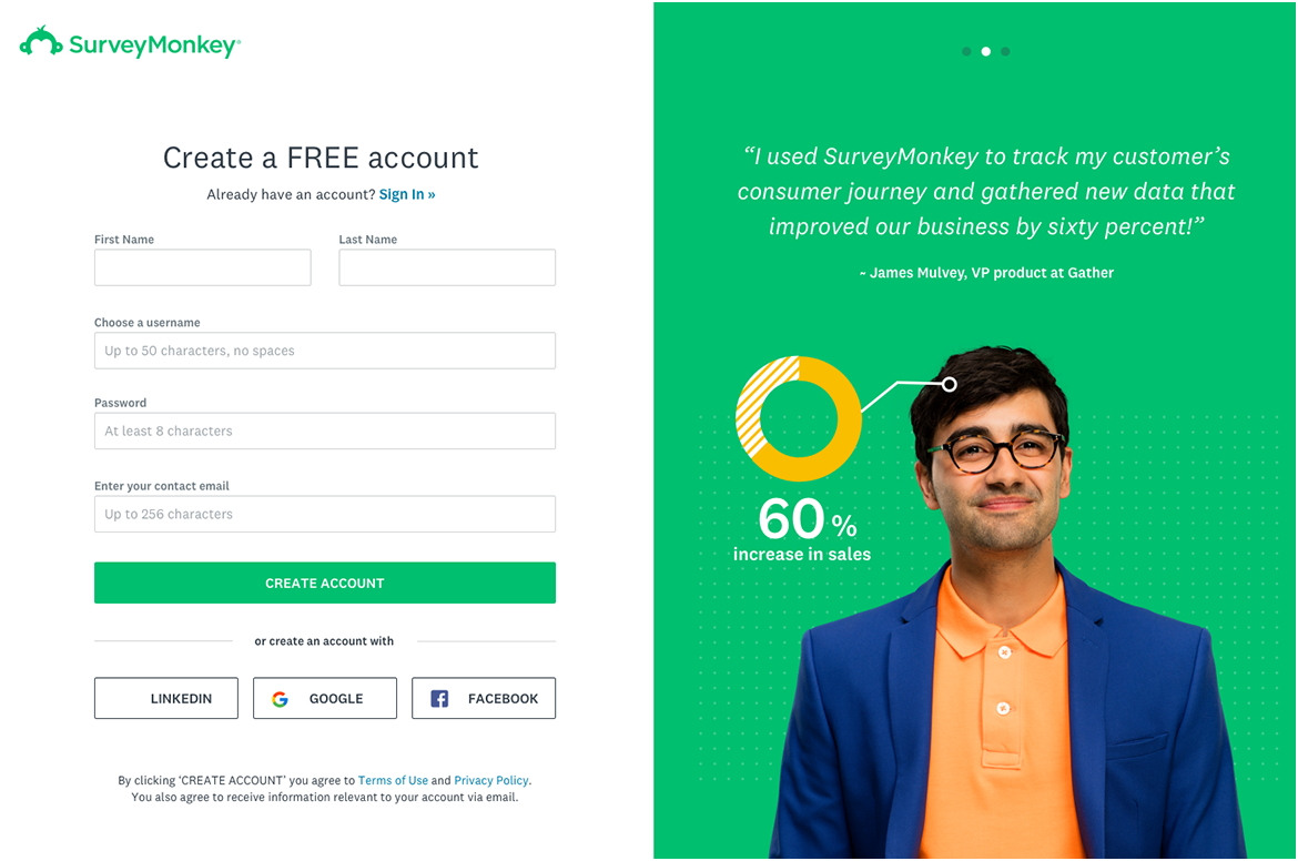
The beauty of this pie chart is that you do not need to read the copy to understand that James has observed a 60% rise in sales by using Survey Monkey.
When you want to display a huge set of information, scatter plots and treemaps are the best bet. Trends are best represented by line charts and bar graphs while pyramids and pie charts can be used to explain the proportion of elements in comparison to each other.
As important as it is to use the right images, selecting the right colors holds equal significance. Your colors must enhance the effectiveness of your landing page and make the design all the more alluring for the subscriber. They have the innate ability to influence the decision of the customer by tapping on their psychology.
Let’s take a look at what different colors stand for.
As obvious as this might sound, many marketers do this wrong. Your CTA must always grab the visitor’s eyeballs and encourage him or her to click-through. For example: If the background of your landing page is blue, it is recommended to have a yellow CTA so that it instantly catches the eye of the visitor.
We have thrown light on 10 important points to remember while designing a high-converting landing page. However, you must not keep away from innovation and think out-of-the-box ideas that would fetch more conversions for you and help you meet the sales targets. Have a look at this infographic for great insights!
 Source: How to Use Visual Elements in Landing Page to Boost Conversions
Kevin George is Head of Marketing at Email Uplers, one of the fastest growing custom email design and coding companies, and specializes in crafting professional email templates, PSD to HTML email conversion and free responsive HTML email templates in addition to providing email automation, campaign management, and data integration & migration services. He loves gadgets, bikes, jazz and eats and breathes email marketing. He enjoys sharing his insights and thoughts on email marketing best practices on his blog.
Read More About Kevin GeorgeTalk to a knowledgeable product specialist to learn more about your requirements and ensure PayKickstart is the perfect fit for your needs.
