Subscription growth hack (by PayKickstart)
Facebook Group - 3,932 members
Visit Group
Whether you’re working toward breaking-even or increasing earnings, it’s important to analyze and understand buyer behavior.
Audience personas differ from business-to-business depending on what services and products are available. For example, a stock music and video company appeals to videographers, filmmakers, and content creators looking to license music while another business might cater to different audience groups.
At the end of the day, the ultimate goal for any business is to turn window shoppers into new customers. With an understanding of marketing psychology, you can optimize your business’s pricing page to attract and retain new business.
But in order for prospective customers to land on your pricing page, you have to strategically direct them there.
A highly optimized pricing page — while necessary — is only effective when paired with optimized website pages and social media channels.
Implementing the right optimization tactics for your business’s pricing page is critical, which is why we’re covering the best practices for presenting, packaging, and pricing your services.
Customers don’t navigate to your pricing page by accident. They are incentivized by your social media posts and blog content to learn more about the services you offer.
The best way to ensure that your content is reaching the right audience personas is to use organic and paid SEO strategies.
But what does this look like in practice?
For your business’s blog, make sure that the content aligns with your audience’s interests. You might publish an incredibly researched and well-written article, but if only a small portion of your audience is searching for content about that topic, the article won’t get much engagement.
Once you factor in what the audience is searching for, it’s important to include internal links to other posts on your blog. In doing so, you can boost engagement across multiple articles at the same time.
New readers are also potential new customers, which is why it’s critical to use CTAs (or calls-to-action) in each blog post. The aim is to hook readers with the content, build up interest in your services, and then direct them right to your pricing page with the CTA.
As far as social media strategies go, investing in paid content and branded content can expedite the process of reaching more people. With a consistent social media presence, you will attract new followers to your business’s accounts and use your platforms to direct followers to your website.
When you optimize these other areas of your business’s online presence, more customers will be enticed to see what you offer on the pricing page.
When designing or revitalizing your pricing page, consider how factors like layout, color, and security will influence buyer behavior on a psychological level.
Prospective customers’ first impression of your pricing page is pivotal.
Within mere seconds, customers choose to dwell longer on the page or leave without reading more. The last thing you want after investing time and money into marketing your business is to find that this page has a subpar conversion rate.
When it comes to the layout, simplicity is key. If the page is difficult to navigate and the content is disorganized, customers will be immediately deterred from learning more.
Customers are looking for dependability in the businesses they purchase from, and your audience will respond differently to your pricing page depending on the layout design.
Looking at a chaotic website page layout, for instance, can make your audience feel on edge, stressed, and even distrustful of your services. On the other hand, a simple layout puts your audience at ease and reaffirms that your business is legitimate and trustworthy.
Your audience shouldn’t feel like they have to decipher the page to understand what they can gain from investing in your services. Ensure that all of the high points are readily accessible: the services you offer, the costs, and the benefits.
Colors can trigger different psychological responses, and it’s helpful to understand how color selection impacts the audience’s behavior. For the pricing page specifically, you might integrate more of the color red into your design, and here’s why:
Researchers have discovered a correlation between color on a pricing page and buyer behavior. Not only is red eye-catching, but it also signals a sense of urgency. In one study, researchers tested how changing the color of the CTA button impacted click-through rates. They found that red CTA buttons were 21% more effective than green CTA buttons.
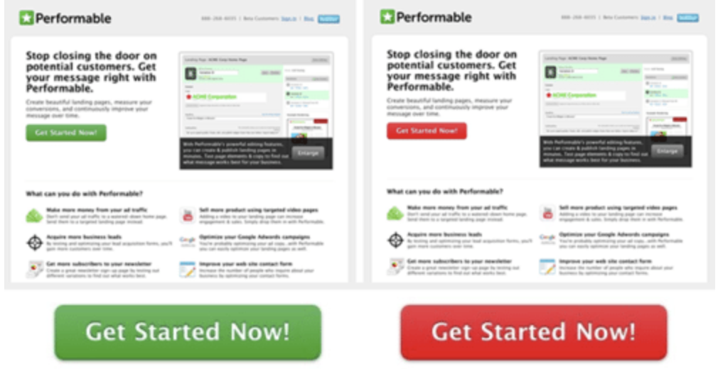
This is extremely valuable information when revamping your pricing page to get more people to act quickly and make a purchase. However, overusing red or any other color can overwhelm your audience in the same way that a chaotic layout would.
Before customers purchase your services, they vet the pricing page to make sure that their purchase will be secure. If your business’s website doesn’t guarantee information privacy, this could hinder your optimization efforts because customers will be less confident that their personal information is safe.
To assure your customers that their trust in your business is well-placed, it’s important to establish a privacy policy and make this information readily available to new customers.
When optimizing your pricing page, take time to research how your competitors are pricing and packaging their services.
If your prices are too high, this can lead to more cases of cart abandonment. If your prices are too low, your profits will likely suffer.
When you conduct regular competitive audits, you can make informed changes to your price points if you discover the prices are unreasonable.
We recommend creating three to four comprehensive packages with clearly outlined benefits, and here’s why.
An excessive amount of packages may overwhelm customers with too many options. Offering five or more packages doesn’t necessarily mean that each package will bring in the same high levels of revenue. In fact, complex pricing packages can actually hinder sales.
Take the company Groove for example. One article describes how this customer support-focused business simplified their pricing page and saw a 350% increase in the conversion rate as a result.
Depending on your target audience personas, it’s not always feasible to offer only two or three packages. The services you provide for individuals will be different from services you provide for major enterprises. In this case, it’s important to emphasize clarity and make the information as concise as possible.
For efficient and smooth conversions, it’s best to maintain simplicity here and adhere to the rule that less is more.
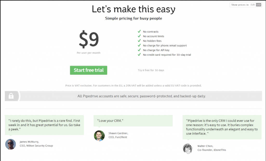
Businesses include testimonials on pricing pages to influence buyer behavior and satisfy the customer’s need for security.
If a prospective customer is considering purchasing your services, strategically-placed testimonials can sway the customer to take action. The fear of passing up on a valuable service functions as a psychological trigger that creates urgency in the same way that the color red would.
At the same, testimonials validate that your company does what you say you can. When new customers come across testimonials on your pricing page, they’re put at ease knowing that your company delivers the quality services that are promised.
Your pricing page tells prospective buyers everything they need to know about your services. To optimize your page effectively, the design of the page should be just as carefully considered as the price points.
Customers respond to urgency when making purchasing decisions, especially when they’re getting a deal. You might use price anchoring to compare your costs with your competitors’ costs and influence customers to favor your services.
By stacking your packages from least to most expensive, customers have the option to make a selection that works best for them. Attracting more buyers to the pricing page is the first step, but for customers to make a purchase, you have to know how to close the deal.
Understanding buyer behavior on a psychological level is necessary when optimizing and profiting from your business’s pricing page.
Mackenzie is a copywriter at Soundstripe, a stock music company that provides filmmakers, creators, and advertisers with royalty free music and resources on how to add music to video.
Read More About Mackenzie Scott