Subscription growth hack (by PayKickstart)
Facebook Group - 3,932 members
Visit Group
Software as a Service (SaaS) has grown leaps and bounds since the early 2000’s. There were an estimated 6,800+ such companies in 2018 and there have only been more to spring up and make their mark in the time since.
Not only are they becoming more commonplace, but the enthusiastic response of users means the industry is projected by 99firms to reach $7.4 billion by the year 2021.
This is clearly not a fluke. Given recent global events, we can even realistically predict an increase on that estimation as more brands focus on their SaaS to offer customers a fully digital experience. Just think of the possibilities for your own software!
One of the biggest questions I field about SaaS has to do with pricing and that isn’t a surprise. When you are dealing with a tangible product, finding the right way to market it is simple. You look at the competition, the industry standard, what you have to offer that may increase the price and you present that cost to the consumer. Simple.
When dealing with a service you have two options: a one time payment for the software or, more frequently these days, a subscription that allows for continued access to that software. Alternatively you have in-app purchases, which may or may not be relevant to your niche, but we will focus on the other two for the purpose of this article.
In addition to pricing itself, we have to make sure the pricing page is optimized for easy understanding of the pricing model, navigation and basic conversion optimization principles. Let’s go through each area to make sure all your basics are covered.
Here are more in-depth guides on building your pricing strategy:
When you already know your product pricing, how to effectively highlight them on your pricing page.
Luckily, we also have a few powerful examples we can look at to see what an average climbing price looks like, which can then be adapted to match what your software provides.
Your pricing page may be on top and at the bottom of your sales funnel which is why SEO is so important.
Search engine optimization includes a lot of aspects that may impact the performance and usability of your page. These are:
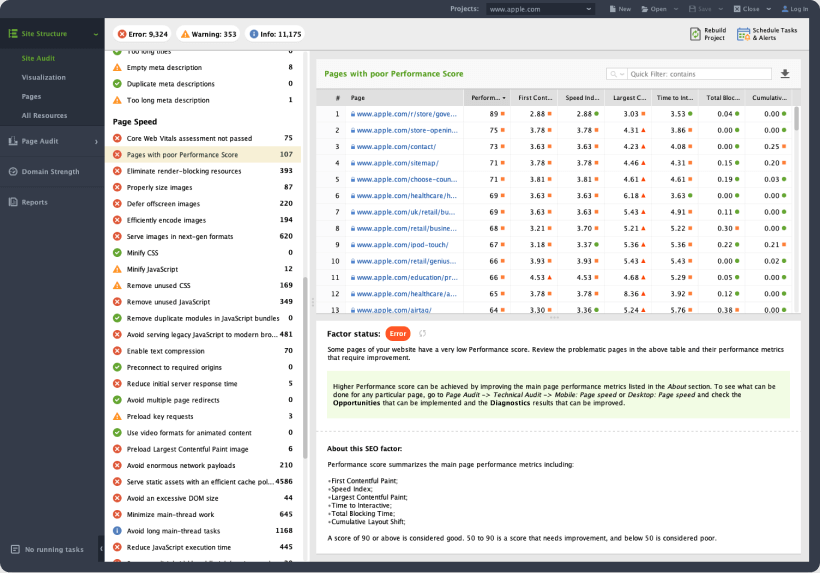
SEO PowerSuite provides a comprehensive website audit feature ensuring your page loads fast, has no broken elements and provides smooth mobile experience (i.e. passes Google’s Core Web Vitals audit):
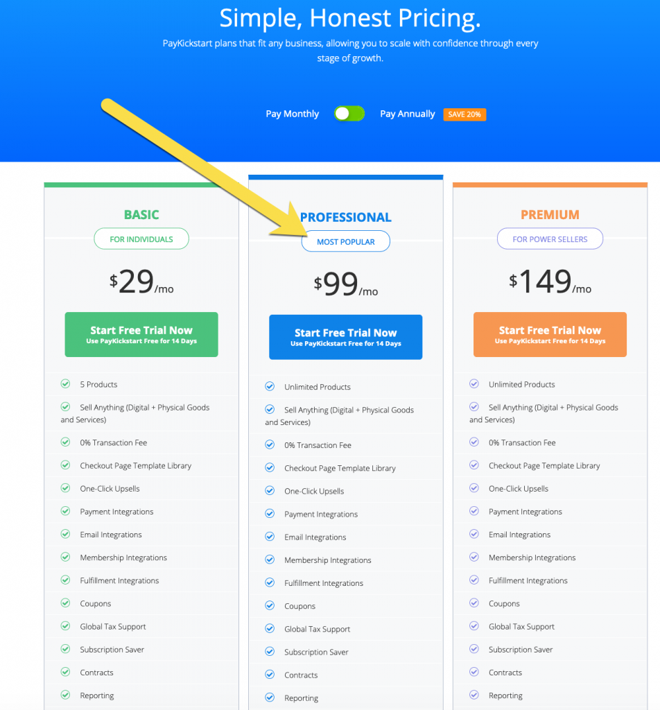
Label the most popular plan to help your customers make a decision. Making their choice more obvious will prompt more of your site visitors to convert:
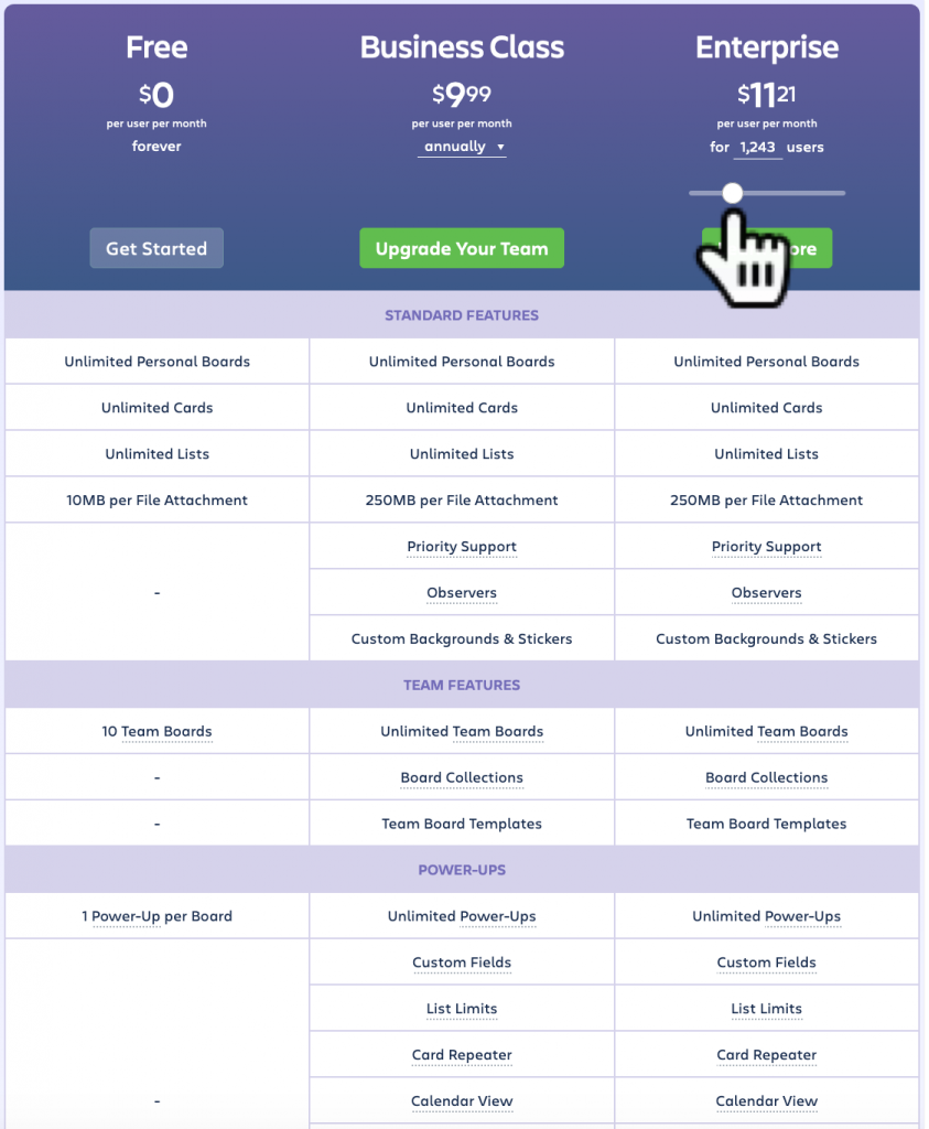
Trello is an interesting example because they have two choices for customers: the “freemium” version, which is always free and gives a good chunk of the features upfront, and the actual premium service that comes in a standard business package or an enterprise for larger companies.
All have unlimited use but start to get more complex where priority support, teams and single sign-ons are concerned. Their enterprise option also has its own scale price per user depending on the number of users who will be dependent on the tool.
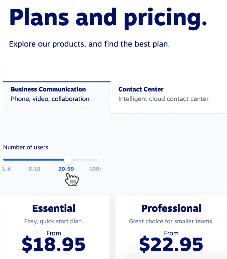
Nextiva updates its business phone system pricing page based on the amount of employees you have:
In many cases, the best way to make your point is to show it. Video is a perfect conversion trigger, when it is done right.
Using videos for conversion optimization is definitely something you need to test, especially now that there are tools that make creating high-quality product demonstration videos easy.
Placeit offers thousands of templates you can customize to match your brand. Simply select a template and create a video to put on your pricing page.
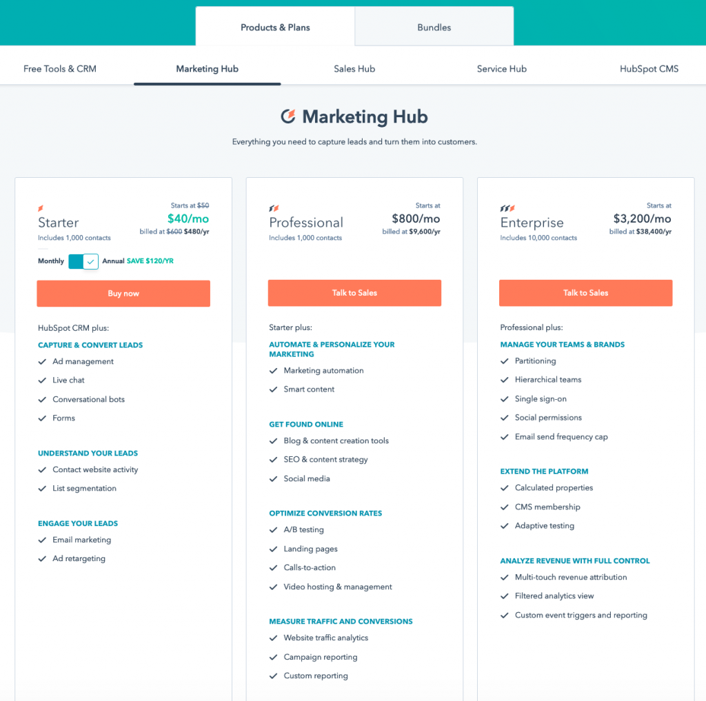
Contrast that with HubSpot, which has three vastly different packages starting at $50 a month and ending at $3,200 a month for enterprise users. They have based that pricing model on the needs of the consumers who will use it and what features will benefit them.
The assumption is that someone with a small, localized brand is not going to need the bells and whistles of a corporation with thousands of employees. That is a fair guess.
To create your buyer personas, use conversation forms throughout your site to collect more data about your site visitors and customers.
To start scaling your own pricing for subscriptions, consider your customer base versus the features you have to offer. Which features are going to be needed for an individual who is the entirety of their user base? That is where the free or cheapest option begins and from there you can space out the features versus cost.
Keep in mind that more choices are not better. Try to keep things as simple as possible, with three or four prices, max.
Optimizing your page is the easiest part of this entire process. First of all, looking at the examples above, you will notice that they try to be clear and clean in how they present the different features. They match up each column so you can see where one set of benefits ends and merges into the next pricing tier.
At the top of columns they will provide other important information. For instance, the maximum amount of people that can be catered to in that particular cost model. If you have 100 employees, you are going to pay less than if you have 1,000. This is very basic but critical for the customer to be able to see at a glance.
You will want to include specific keywords that will be caught in search queries, but don’t focus too heavily on SEO. Remember that your entire site is an opportunity to capture customer’s attention. You want your SaaS pricing page to be streamlined. You may even include it all in a grid design on a single page, with internal stop links that unfold the sections.
Finally, always try several designs and layouts before picking the best performing ones. Here’s a solid guide on how to split test your funnel.
Do you have any ideas on how to optimize an SaaS page or find the perfect pricing model? Let us know in the comments.
Ann Smarty is the co-founder of Smarty.Marketing, an SEO agency specialising in AEO/GEO, digital PR, and Reddit marketing. She is the former Editor-in-Chief of Search Engine Journal and a contributor to prominent search and social blogs, including Small Biz Trends and Mashable. Ann is also a frequent speaker at Pubcon and the host of a weekly Twitter chat #vcbuzz
Read More About Ann Smarty